Scaling Design at La Redoute
A Design Ops-Led Transformation for Unified Excellence
 < Prev
Case 02 / 06
Next >
Context & Goals
La Redoute, a household name in French retail, has undergone a significant rebranding in recent years, successfully revitalizing its identity across marketing channels. However, this transformation left a critical gap: its digital interfaces remained fragmented and inconsistent, unable to fully reflect the brand’s renewed vision.
To address this, La Redoute initiated the development of a comprehensive Design System aimed at unifying its Product Design and Marketing Studio efforts. This project sought not only to streamline design and development workflows but also to foster stronger alignment between teams and ensure cohesive user experiences across platforms.
On the Product & Design side, the scope encompassed Web and Mobile Apps (iOS and Android), which were burdened by an aging and complex IT infrastructure. The CMS in use was outdated, underperforming, and ill-equipped to meet the company’s current challenges. This added an additional layer of complexity, requiring careful navigation to ensure the design system could adapt and deliver results within these constraints.
With a cross-functional approach, the initiative brought together stakeholders from diverse disciplines, including design, product management, development, and marketing, to collaboratively reimagine and operationalize the company’s design practices. The project marked a pivotal moment in La Redoute’s evolution, aiming to bridge the gap between brand identity and user experience in the digital realm.
Team & Stakeholders
Product Design & Research
- 1 Head of Design
- 1 Lead Product Designer
- 5 Product Designers
- 2 UX Researchers
Product Management & Technical Teams
- 1 Lead Product Manager
- 4 Product Managers
- 1 Lead CPTech
- 4 Technical Project Managers
Design Studio (Marketing)
- 1 Design Studio Manager
- 2 Art Directors
- 1 Lead Webdesigner
- 8 Webdesigners
- 2 Writers
- 5 Web Integrators
Timing
- 16 Months
- February 2023 - April 2024
Responsabilities
Design System Manager & Design Ops
- Design System Advocacy & Evangelization
- Backlog & Roadmap Management
- UI Component Design & Delivery
- Figma Administration & Office Hours
- Design System Office Hours
- Design File Architecture
- Design Process Refinement
- Definition of Ready
Problematic & Challenges
La Redoute’s design and development processes faced significant obstacles, rooted in legacy systems, misaligned priorities, and fragmented workflows. These challenges can be grouped into four critical areas:
1. Legacy Systems and Organizational Complexity
La Redoute relied on an aging CMS that was ill-equipped to handle the demands of modern web and app development. This outdated infrastructure created technical debt and inefficiencies, limiting the scalability of design improvements. Additionally, years of disconnected workflows and tools compounded the problem, making it difficult to establish streamlined processes. The organization’s low design and product maturity further exacerbated these issues, with limited governance, unclear workflows, and inconsistent deliverables.
2. Misaligned Vision and Priorities
The company’s teams operated with a production-first mindset, focusing on creating individual screens rather than considering cohesive user journeys. This approach led to fragmented and inconsistent user experiences. Furthermore, decision-making was often driven by subjective opinions rather than being informed by a clear branding strategy or data-driven insights. Without a unified vision, it was challenging to align design and product efforts to meet user and business needs effectively.
3. Disjointed Operational and Organizational Architecture
Collaboration between marketing and product teams was hindered by structural silos and misaligned workflows. While product teams followed agile methodologies, the marketing studio adhered to a waterfall approach, creating friction and inefficiencies. This divergence resulted in delays, duplicated efforts, and inconsistencies in brand presentation across platforms. Additionally, Figma files and component libraries mirrored this fragmented structure. Files were organized around daily operational realities rather than a cohesive product logic, scattering essential assets across squads and sprints. The lack of a unified system caused confusion over component ownership, status, and alignment with brand guidelines, further compounding inefficiencies.
4. Ineffective Decision-Making Practices
Despite having access to extensive data, decision-making processes within the organization were frequently disconnected from broader strategic goals. Data was often analyzed and acted upon in isolation, stripped of context, and rarely subjected to a holistic zoom-in/zoom-out approach. This approach led to decisions that were sometimes misaligned with actual user needs. Compounding this issue, design practices were heavily influenced by subjective opinions, rather than being grounded in user research or clearly defined branding principles. These fragmented methods introduced inconsistencies, slowed workflows, and diminished the overall impact of design efforts.
Timeline
-
Q1 - Establishing the Foundations
- Design System Evangelization
- User & Stakeholder Interviews
- Figma File Audit
- Component Audit
-
Q2 - Structuring and Building Momentum
- Product Architecture Workshops
- Documentation & Tool Benchmarking and Procurement
- Design System Advocacy
- Foundations 2.0
- Component Creation: First Iteration (1 Library Web / 1 Library App)
- Figma Administration
-
Q3 - Iteration and Expansion
- Design System Advocacy
- Foundation's Design Tokens
- Documentation & Tooling Setup
- Storybook Advocacy
- Completion of First Library Iteration
- Begin Second Iteration on Libraries (Unified Web & App Libraries)
- Design System & Figma Office Hours & Administration
-
Q4 - Unifying and Refining
- Design System Advocacy
- Design Tokens Refinement (Routing & Token System)
- Documentation
- Storybook Advocacy with a POC for Web and Native Apps
- Completion of Second Library Iteration (Unified Web & App Library)
- Agency Oversight for AM PM Brand Soft Rebranding
- Creation of UI Foundations & Components for AM PM (Training Marketing Studio)
- Design System & Figma Office Hours & Administration
-
Q5 - Scaling and Transitioning
- Design System Advocacy
- Design Tokens Refinement
- Documentation
- Storybook Advocacy with a POC for Web and Native Apps
- New UI Foundations & Components for La Redoute
- Oversight of Digital Rebranding for La Redoute
- Passation and Knowledge Transfer
- Design System & Figma Office Hours & Administration
Solutions
Part 1: Strategic Approach – Stakeholder & User Focus
To ensure the success of La Redoute’s Design System initiative, the project began with a strategic, user-centered, and stakeholder-driven approach. This involved deeply understanding the needs, pain points, and workflows of all stakeholders to align priorities and establish a shared vision.
1. Stakeholder Interviews: Building Empathy Across Teams
A comprehensive series of interviews were conducted with key stakeholders across disciplines, including Product Managers, Designers, Studio Teams, Integrators, Technical Project Managers, Developers, and Q/A Specialists. These interviews uncovered critical pain points and areas for improvement:
- Pain Point 1: Difficulty locating assets within disorganized Figma files.
Assets were scattered across numerous files, causing inefficiencies and frustration among teams. - Pain Point 2: Confusion stemming from multiple, uncoordinated libraries with unclear ownership.
Teams struggled with conflicting libraries, leading to duplicated efforts and inconsistent outputs. - Pain Point 3: Siloed workflows between Product and Marketing teams.
The lack of collaboration between these teams resulted in delays and misaligned priorities. - Pain Point 4: Decision-making heavily reliant on disconnected data.
Despite being data-driven, the organization often failed to contextualize data effectively, leading to suboptimal outcomes.
These insights were critical in shaping the Design System to address the specific needs and challenges of its users.
2. Creating Buy-In Through Advocacy
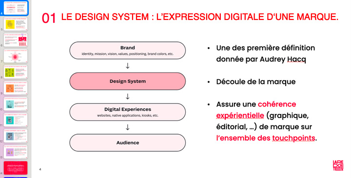
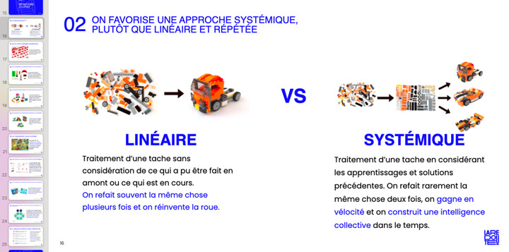
With a clear understanding of stakeholder needs, the next step was to align teams around the Design System’s value. Advocacy efforts emphasized its potential to enhance collaboration, streamline workflows, and improve consistency:
- Engaging Presentations: Tailored presentations demonstrated the system’s benefits, focusing on how it would address pain points and enhance deliverables for each team.
- Practical Use Cases: Real-world examples showcased the system’s immediate impact on workflows, reinforcing its relevance and necessity.
- Customized Messaging for Key Audiences:
- Developers: Promised smoother handoffs, fewer errors, and increased velocity.
- Designers: Offered consistency, clarity, and creative freedom within a structured framework.
- Leadership: Highlighted long-term efficiency gains and ROI.
Through these efforts, stakeholders began to view the Design System as a shared tool for achieving both individual and organizational goals.
3. Workshops to Build Alignment
Workshops played a pivotal role in fostering collaboration and creating a shared sense of ownership:
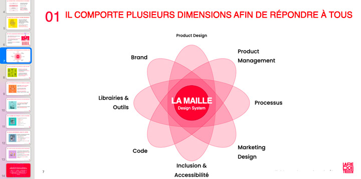
- Product Architecture Sessions: Explored user journeys and workflows to identify redundancies and inefficiencies.
- Library Consolidation Workshops: Unified fragmented libraries into cohesive systems with clear ownership and governance.
- Process Integration Workshops: Ensured the Design System was embedded into the product lifecycle, from discovery to delivery.
These workshops not only aligned teams but also demonstrated the Design System’s role as a catalyst for improved collaboration and efficiency.
By taking a strategic and empathetic approach, this initiative laid a strong foundation for a Design System that directly addressed stakeholder needs while fostering a culture of collaboration and innovation.
Part 2: Building and Scaling the Design System
At La Redoute, the creation of a robust and scalable Design System was not just a technical endeavor—it was a cultural transformation. This initiative required a balance of strategic advocacy, comprehensive governance, iterative development, and thoughtful tooling optimization to address the company’s specific challenges. By prioritizing accessibility, adaptability, and collaboration, the Design System laid the foundation for consistency and innovation across platforms.
1. Governance, Advocacy, and Ownership
The success of the Design System hinged on advocacy and governance, which helped align stakeholders and integrate new processes across diverse teams:
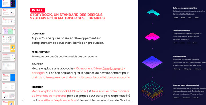
- Advocacy for Cultural Change: Advocacy extended beyond tools to instigate a mindset shift across departments. This included promoting Storybook as a central tool to bridge the gap between design and development. By demonstrating its potential for improving workflows and establishing a single source of truth, resistance was transformed into buy-in from both developers and managers.
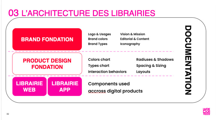
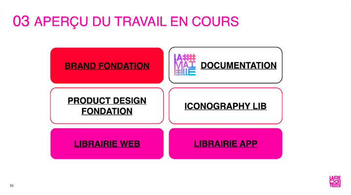
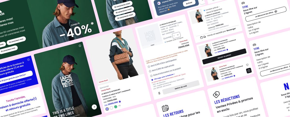
- Tailored Libraries for Distinct Needs: Recognizing the diverse workflows of Product Design and Studio Teams, the Design System included:
- Product Design Library: Focused on functional, reusable components for Web and App teams.
- Studio Asset Library: Tailored to the marketing team’s needs for creating assets at scale and delivering campaigns efficiently.
- Multi-Brand Strategy: Managed separate systems for La Redoute and AM PM, reflecting their distinct audiences and organizational contexts. This approach avoided creating a unified library with token-based themes, ensuring that each system was optimized for its specific users and workflows.
2. Foundational Redesign and Tokens Implementation
The redesign of the foundational elements ensured the Design System was accessible, scalable, and rooted in best practices:
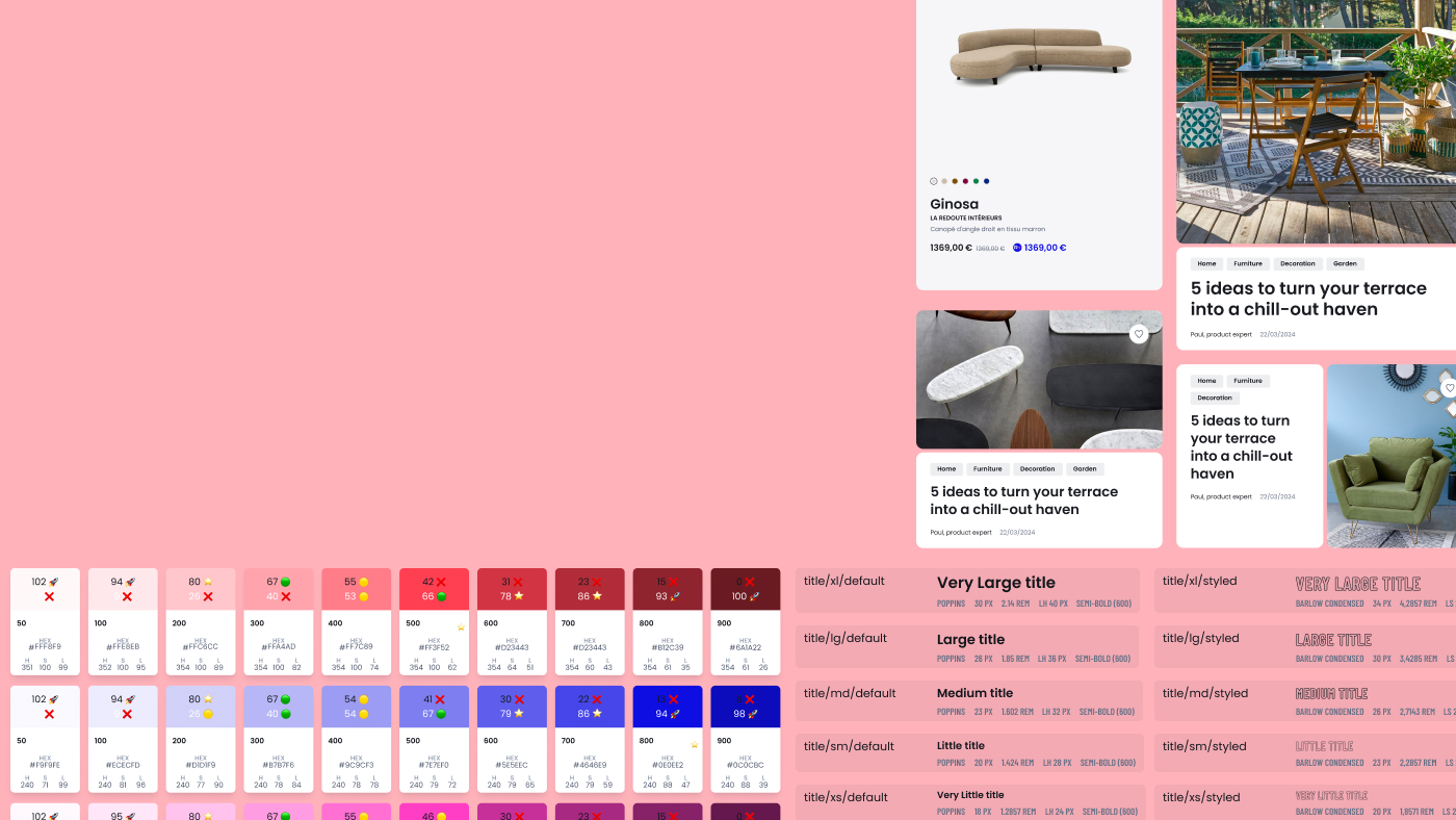
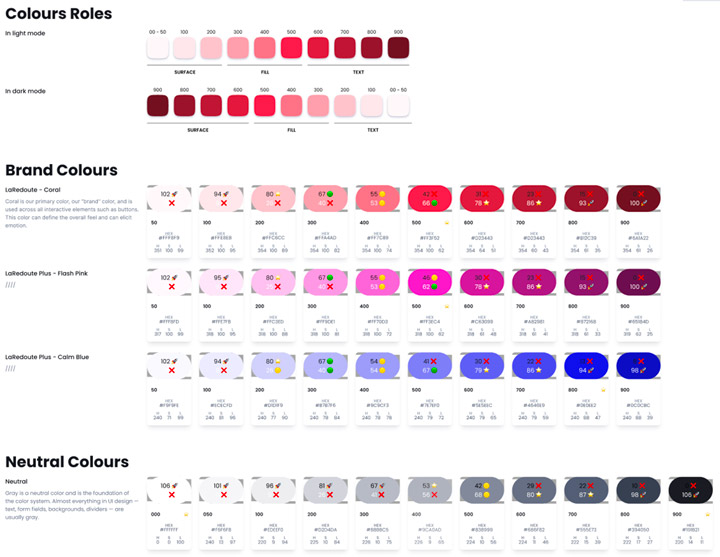
- Algorithmic Foundations for Accessibility: Developed a color system using LCH-based scales, significantly improving contrast ratios and adhering to modern APCA accessibility standards. This provided better visibility and usability across a range of digital interfaces.
- Device-Specific Typography: Introduced a responsive font scale to enhance readability and aesthetic consistency across devices, tailoring sizes for Web, iOS, and Android platforms.
- Optimized Iconography: Migrated to stroke-based SVG icons, reducing file sizes for faster performance and greater versatility in usage.
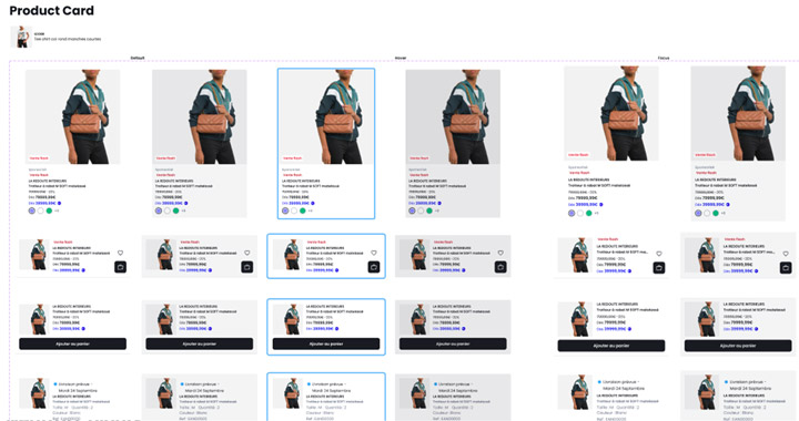
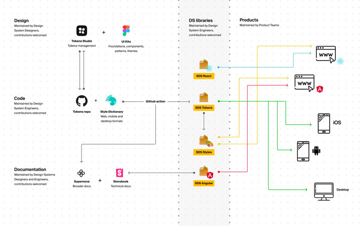
- From Foundations to Tokens: These foundational improvements were translated into a comprehensive system of design tokens, covering typography, spacing, colors, and interaction states. These tokens provided a unified framework for ensuring consistency across platforms and simplifying updates.
3. Component Libraries and Design Tokens Management
A core achievement of the initiative was the iterative development of component libraries and the technical implementation of design tokens, ensuring scalability and alignment across teams and platforms:
- Phases of Component Consolidation and Refinement:
- First Phase: Merged fragmented libraries from different squads into separate Web and App libraries. This step addressed immediate redundancies and gaps, creating a more consistent structure across teams.
- Second Phase: Unified these libraries into a single cross-platform library, enabling seamless collaboration and ensuring consistency across Web and App design needs.
- Third Phase: Just before my departure, a visual redesign phase was initiated in collaboration with an external agency. I played a key role in supervising the agency to maintain La Redoute’s vision while ensuring high standards for delivery quality, web accessibility, and design consistency.
- Technical Implementation of Design Tokens: Collaborated closely with developers to transition foundational tokens (e.g., colors, typography, spacing) into semantic tokens mapped to functional use cases. This collaboration streamlined workflows and enhanced the usability of tokens in both design and development environments.
- Establishing Governance for Contribution and Maintenance: Introduced a multi-level library contribution system to ensure scalability and adaptability:
- Local Libraries: Enabled personal or squad-specific experimentation and iteration.
- Team or Thematic Libraries: Provided shared components for specific team needs or themes, such as seasonal marketing campaigns.
- Global or System Libraries: Centralized reusable components and assets governed by the Design System for organization-wide consistency.
- Continuous Advocacy and Support: Hosted regular Design System Office Hours to provide ongoing support, answer questions, and gather feedback. These sessions reinforced engagement and facilitated continuous improvement.
This comprehensive approach ensured that the component libraries and design tokens evolved as dynamic, scalable assets, capable of supporting both short-term and long-term goals across La Redoute’s diverse teams.
4. Tools and Process Optimization
Enhancing tools and workflows was critical for ensuring seamless collaboration, improving efficiency, and maintaining the high quality of deliverables across La Redoute’s teams.
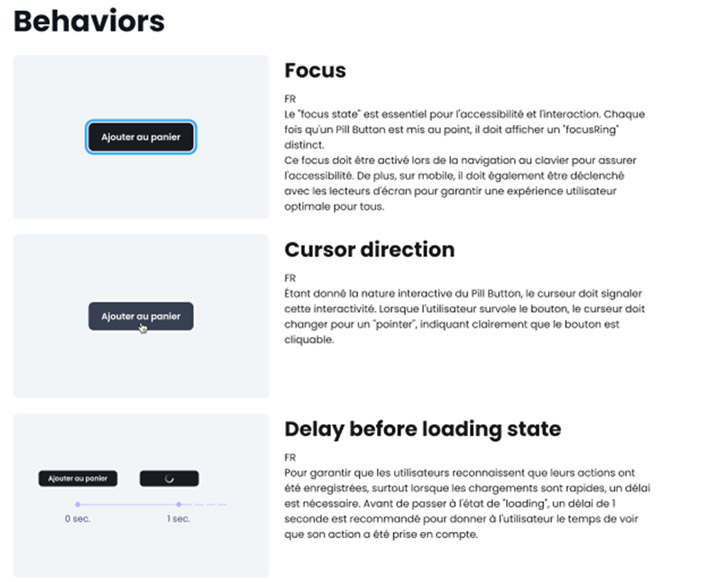
- Storybook for Native Apps: Successfully introduced Storybook for Native, overcoming significant technical challenges to enable component visualization and testing across web and native platforms. This integration bridged gaps between design and development teams, ensuring consistency across environments.
- Automated Q/A with Chromatic: Integrated Chromatic into the workflow, introducing automated visual regression testing. This allowed for faster validation of design consistency, reducing errors and streamlining the quality assurance process.
- Comprehensive Documentation: Delivered a robust documentation framework designed to guide designers, developers, and studio teams. This documentation provided:
- Clear guidelines on utilizing the Design System effectively.
- Steps for onboarding new team members quickly and efficiently.
- Accessible references for maintaining system consistency over time.
These optimizations collectively supported La Redoute’s broader Design System initiative, enabling seamless cross-functional collaboration and ensuring a scalable and efficient workflow across web and app platforms.
Part 3: Design Ops – Catalyzing Organizational Change
The Design Ops initiative was pivotal in transforming how teams collaborated, designed, and delivered. Operating within a context of legacy systems and organizational silos, Design Ops sought to bring structure, scalability, and efficiency to the company’s processes. This approach emphasized creating a culture of shared practices, improving handoffs, and empowering teams with the tools and training needed to thrive in a fast-paced digital environment.
1. Culture Through Process and Rituals
Shaping an effective design culture at La Redoute meant introducing processes and rituals that bridged gaps between teams and instilled a sense of shared purpose:
- Establishing Shared Practices:
To align Product, Marketing, and Tech teams, we implemented a unified framework of rituals, including:
- Cross-functional syncs: Weekly meetings provided a space for sharing updates on design challenges and operational issues, promoting transparency and collaboration.
- Design crits: Structured critique sessions improved cross-team visibility and encouraged constructive feedback, resulting in higher-quality outputs.
- Sprint planning integration: Design priorities were seamlessly embedded into agile rituals, ensuring alignment with product and development roadmaps.
- Breaking Silos: Traditional silos between departments often led to inefficiencies and duplicated efforts. Through shared rituals and processes, we fostered collaboration between Product, Marketing, and Tech, aligning their goals and creating a more cohesive workflow.
This foundation of rituals and processes set the stage for a unified design culture that could adapt to the challenges of scaling and delivering high-quality experiences.
2. Product Architecture Collaboration
Faced with fragmented workflows and unclear product definitions, a comprehensive effort to re-architect the product framework was initiated in close collaboration with Product Managers (PMs). This initiative laid the foundation for better alignment, clearer scope, and more efficient team collaboration:
- Redefining Product Scope with Themes, Epics, and Features:
To address inconsistencies in how projects were scoped and executed, a structured product hierarchy was introduced:- Themes: High-level strategic goals that encapsulate long-term objectives or organizational priorities.
- Epics: Large-scale initiatives tied to a Theme, often reflecting multi-sprint or multi-quarter deliverables.
- Features: Specific user-facing or technical functionalities under an Epic, designed to deliver measurable value.
- Impact on Collaboration and Workflow:
This new structure provided a common language for squads, enabling teams to align on objectives while maintaining clarity across overlapping responsibilities. It reduced the silos between teams and improved transparency. - Aligning Design with Product Architecture:
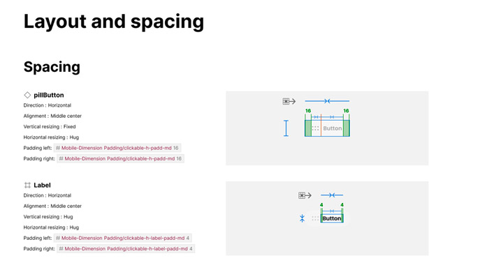
- Redesigned Figma file structures to reflect the new product hierarchy, linking artefacts like wireframes, IA, and mockups to Themes, Epics, and Features.
- Encouraged designers and developers to use this shared framework for planning and execution, reducing confusion and improving accessibility.
- Iterative Development with Feedback Loops:
Weekly feedback sessions with PMs, Designers, and Developers allowed for continuous refinement of the product structure. This iterative approach ensured the architecture evolved to meet both business needs and user expectations.
This initiative not only clarified the scope and execution of product initiatives but also enhanced collaboration across the organization, creating a more unified and efficient workflow.


3. Design-to-Development Handover and Process-Driven Collaboration
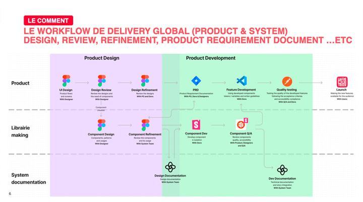
Ensuring seamless collaboration between design and development required a combination of rigorous methodologies, optimized tooling, and shared rituals that aligned teams at every stage of the design-to-delivery pipeline.
- Structured Design Methodologies: Advocated for a disciplined approach to design, emphasizing pre-mockup artefacts to enhance early alignment and reduce costly iterations:
- Feature & Benefit Identification: Defined the purpose and value of each feature to align stakeholders from the outset.
- User Journey Mapping: Charted end-to-end user experiences to identify friction points and opportunities.
- Information Architecture & Priority Guides: Prioritized content and interactions, focusing on usability before diving into high-fidelity mockups.
- Rapid Iterations on Low-Cost Artefacts: Encouraged quick iterations on wireframes and IA to streamline feedback cycles, saving time and cost while ensuring faster team alignment.
- Streamlined Design-to-Development Handover: Introduced rituals to bridge the gap between design intent and technical execution:
- Walkthrough Sessions: Held pre-handoff walkthroughs to clarify design intent, address technical constraints, and minimize rework.
- Figma’s Dev Mode Advocacy: Promoted consistent use of Dev Mode to simplify handoffs, ensuring all annotations were easily accessible and actionable by developers.
- Integrated QA as a Design Ritual: Formalized designer participation in QA processes, validating adherence to design specifications and maintaining quality across platforms.
- Refined Operational Workflows: Partnered with Product and Tech leads to embed Design Ops principles into agile rituals, including:
- Backlog Grooming: Ensured design tasks were aligned with development priorities.
- Sprint Reviews: Incorporated design feedback loops to refine deliverables and foster collaboration.
By combining these practices and tools, the initiative fostered stronger alignment, minimized miscommunication, and improved delivery timelines, positioning La Redoute’s teams for sustained success.
4. Knowledge Management & Training
Centralizing and sharing knowledge was essential to ensure the sustainability of Design Ops initiatives and empower the team to work more effectively:
- Comprehensive Figma Training:
Tailored workshops were designed to cater to a range of roles within the organization, from designers to stakeholders viewing files. These sessions covered:
- Advanced design techniques such as component overrides and token-based styling.
- Best practices for Figma file organization and collaboration.
- Hands-on guidance for navigating and utilizing Figma’s powerful features, ensuring consistency and efficiency across all teams.
- Centralized Documentation Framework:
A robust and accessible documentation framework was developed to support operational knowledge sharing:
- Processes for maintaining up-to-date guidelines on tools, workflows, and Design System components.
- Easy access for all team members, ensuring they had the resources to contribute and align with ongoing initiatives.
- Onboarding for New Team Members: Tailored onboarding programs were introduced, integrating tool mastery, end-to-end design processes, and cross-functional collaboration principles. These programs ensured that new hires could quickly adapt to their roles and align with organizational workflows.
By creating a strong foundation of knowledge sharing and skill-building, these initiatives strengthened team collaboration, reduced onboarding time, and improved alignment with Design Ops practices.
5. Advocating for Scalability and Future Growth
Positioning Design Ops as a strategic enabler required demonstrating its value and building scalable systems for the future:
- Reusable Frameworks for Scalability:
- Modular workflows were introduced to adapt to future needs, whether for new product launches or branding updates.
- These workflows ensured that design and operational processes could evolve with the organization, maintaining relevance and efficiency.
- Demonstrating ROI to Leadership:
- Success metrics, such as reduced delivery timelines and improved design quality, were tracked and presented to leadership.
- These metrics showcased the impact of Design Ops on the business, advocating for continued investment in tools, training, and processes.
- Embedding a Culture of Continuous Improvement:
- Feedback loops and retrospectives were established as part of the Design Ops framework, fostering a mindset of iteration and growth.
- Teams were encouraged to experiment and refine workflows, ensuring adaptability to emerging challenges and opportunities.
- Future-Proofing Through Strategic Design Ops:
- Collaborated with leadership to integrate Design Ops into long-term organizational strategies, ensuring its impact extended beyond immediate projects.
- Prepared teams for scalability by embedding practices that could support growth across teams, products, and markets.
These efforts ensured that Design Ops at La Redoute was not just a solution for immediate challenges but a foundational system for driving sustained organizational growth and innovation.
Results
- Unified Design System Adoption: Successfully consolidated and enhanced component libraries for web and mobile, aligning them with La Redoute's branding and accessibility goals. This provided a consistent user experience across platforms and reduced design inconsistencies.
- Optimized Collaboration Processes: Bridged gaps between Product, Marketing, and Tech teams through structured rituals and an end-to-end design-to-delivery process, fostering stronger interdepartmental alignment and collaboration.
- Improved Operational Efficiency: Established scalable workflows and governance frameworks, reducing rework cycles and enabling faster delivery timelines.
- Empowered Teams Through Training: Upskilled team members across roles, from designers to stakeholders, improving Figma usage and design practices while accelerating onboarding processes.
- Enhanced Product Definition and Architecture: Re-architected the product framework with PMs, aligning features with strategic themes and epics, and providing clarity across all squads.
- Strategic Positioning of Design Ops: Demonstrated the ROI of Design Ops through improved time-to-market, higher quality deliverables, and sustained organizational alignment, positioning it as a cornerstone for future growth.
These results not only addressed the immediate challenges but also established a foundation for La Redoute's long-term scalability and digital transformation.
Deliverables
- Comprehensive Design System including Web and Mobile libraries
- Refined Foundations: Color, Typography, Spacing, and Interaction Tokens
- Unified Component Libraries: Web and App, later merged into a single cross-platform library
- Multi-brand Strategy: Separate systems for La Redoute and AM PM
- Design Tokens: Implemented foundational and semantic tokens
- Storybook Integration: Web and Native, with automated QA via Chromatic
- Figma Training Program for all team roles (Designers, PMs, and Viewers)
- Centralized Documentation Framework for Design System and processes
- Re-architected Product Framework: Themes, Epics, and Features
- Onboarding Programs tailored to various team roles
- Design Principles to guide cohesive and scalable design practices
- Design Ops & Design System OKRs to track progress and measure success
- Design Crits and Sprint Planning Rituals for cross-functional alignment
- Improved QA Process with integrated design validation
- Operational Roadmap and Backlog Management
