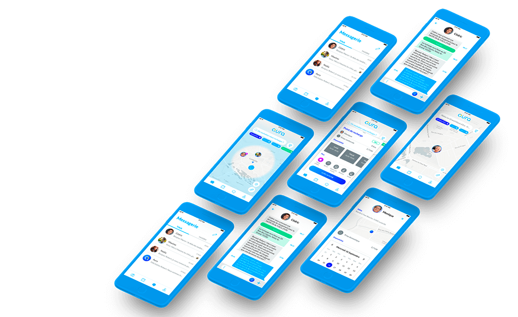
Engie - Service Design
Creation of a charging station sharing service within the brand ecosystem
 < Prev
Case 06 / 06
Next >
The Origin: From Competition to Collaboration
The project began as part of a student competition, where the goal was to propose innovative solutions for Engie’s customer portal. The initial brief was broad and misaligned with tangible business needs, making it challenging to address real user pain points. To overcome this, we applied Design Thinking methodologies to reframe the problem and deliver a solution that was both user-centered and business-aligned.
Our proposal focused on three key pillars:
- A Streamlined User Experience with a Fresh Interface: We redesigned the information architecture and user journeys to ensure clarity and ease of navigation. Coupled with a modernized UI, this approach rejuvenated the portal’s look, making it cleaner, more readable, and aligned with contemporary design standards.
- A Leasing Solution for Accessibility: We introduced a leasing model (LOA) for charging stations to align with evolving consumption trends. This approach not only made the product more financially accessible for users but also positioned Engie’s offer as an innovative, consumer-friendly solution.
- Peer-to-Peer Charging Station Sharing: To address charging infrastructure challenges, we proposed a service that enabled individuals to share their charging stations. This strategic solution aimed to boost the adoption of electric vehicles, foster Engie’s customer loyalty, and create a rural charging network that turned a pain point—long charging times—into an opportunity to explore and revitalize the countryside.
While we ultimately placed second in the competition for not directly adhering to the brief, the strength and relevance of our solution caught Engie’s attention. This led to a subsequent mission where I was invited to further develop and implement the peer-to-peer charging station sharing concept as part of their ongoing innovation efforts.
Context & Goals
After the competition, a series of emails, phone exchanges, and a finalized deal led us to the next phase. Alongside a UI Designer colleague, we began working at the end of July for a 28-day sprint to deliver an MVP for the peer-to-peer car charging station sharing service.
Engie’s interest in our proposal stemmed from its alignment with an idea they had previously explored during a Design Sprint. However, the initial groundwork raised significant concerns. The user research Engie conducted was based solely on internal employees—data that was inherently biased and did not reflect the realities of electric mobility consumers. The personas derived from this research were superficial, providing little actionable insight for building a targeted, impactful solution.
Recognizing the limitations, we requested additional user research to better understand the real end-users. In particular, we aimed to gather relevant data on the secondary target audience—suburban and rural users likely to share their charging stations. Unfortunately, these efforts hit a wall. We faced resistance and a reliance on assumptions that remained unverified throughout the project.
Adding to the challenge, Engie had a tight deadline: the MVP had to be ready for presentation at the Paris Auto Industry Exhibition. The event served as an opportunity to not only showcase the project but also collect feedback from real users—a goal we fully supported.
Upon starting at Engie’s office, we were onboarded by the Head of Design and Lead UX Designer. Working alongside a Lead Interactive Designer, the Head of Marketing, and a Product Owner, our goal was clear: deliver a functional MVP to facilitate charging station sharing and align with Engie’s strategy for driving innovation in electric mobility.
Team & Stakeholders
- 1 Service Designer
- 1 UI Designer
- 1 Lead Designer
- 2 Heads of (Design /Innovation)
- 1 Product Owner
- Various BU representatives
Timing
- Summer 2018
- 6 weeks of Design
Responsabilities
Service Designer / Product Manager
- Team lead and sprint facilitation
- Information architecture and user experience design
- Service design and strategy recommendations
- Ergonomy and interface structure
- Backlog prioritization and roadmap planning
Problematic & Challenges
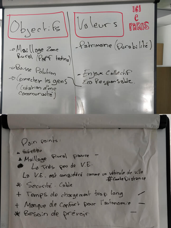
Lack of Relevant User Data
The initial user research, conducted by another freelancer, was not aligned with UX best practices. The sample was limited to four Engie employees, none of whom were representative of real electric car users, and the research lacked both depth and actionable insights. Without a clear understanding of end-user pain points and behaviors, our team had to rely on assumptions rather than concrete data. This gap limited our ability to create precise, user-centered solutions from the outset.
Late Integration of the Product Owner
The Product Owner (PO) joined the project midway, inheriting a predefined list of tasks and priorities. This late arrival caused significant misalignment. The PO did not establish any agile rituals or product processes, nor did they familiarize themselves with the existing documentation. As a result, the team lacked clear direction and had to integrate PO responsibilities into our own scope. To mitigate this, we adopted daily meetings to maintain communication, but the absence of proper structure created additional organizational challenges.
Technical Complexity and Ecosystem Communication
The final challenge stemmed from the need to design a product within a complex technical ecosystem. Understanding how devices and systems would communicate—between charging stations, users, and platforms—was critical to delivering relevant and scalable solutions. This required a detailed product design approach that accounted for technical feasibility while maintaining a focus on user needs.
Timeline
-
W1_Initiation
- Documentation review
- Research, immersion & documentation alignment
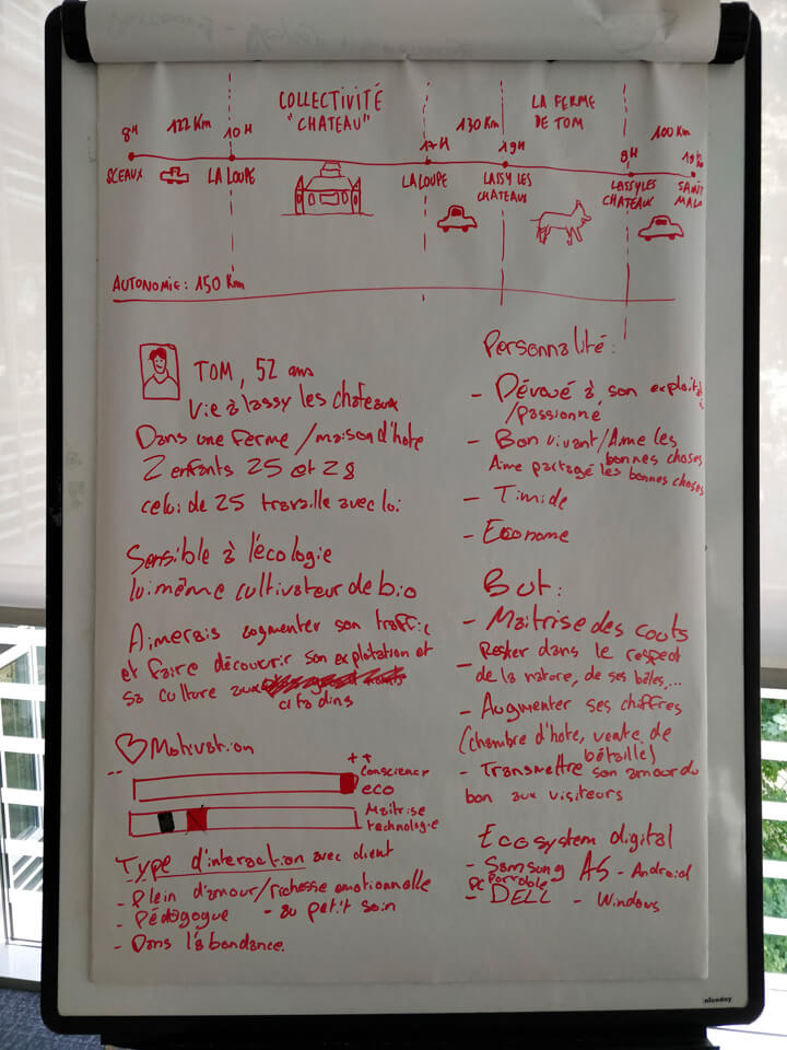
- Personas
- Stakeholder & decision-maker identification
-
W2_Concept
- Refining the concept and defining the Unique Value Proposition (UVP)
- Feature prioritization and user journey mapping
- Service Blueprint
- Information Architecture
- Wireframes
-
W3_Branding/Prototype
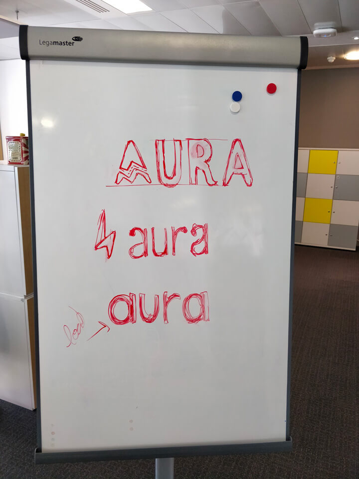
- Branding
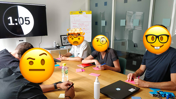
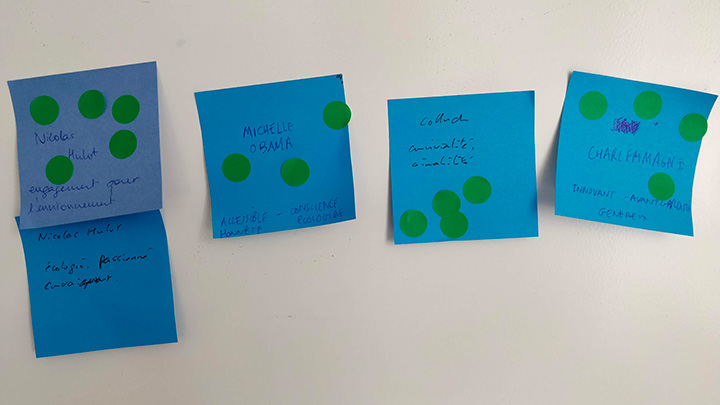
- Brand personality workshop
- Logo
- Colors
- Typography
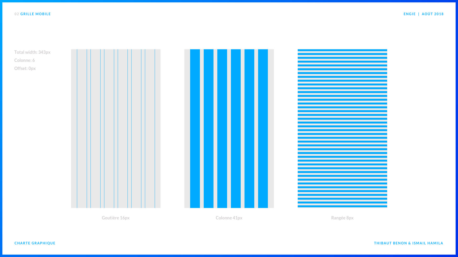
- Grid system
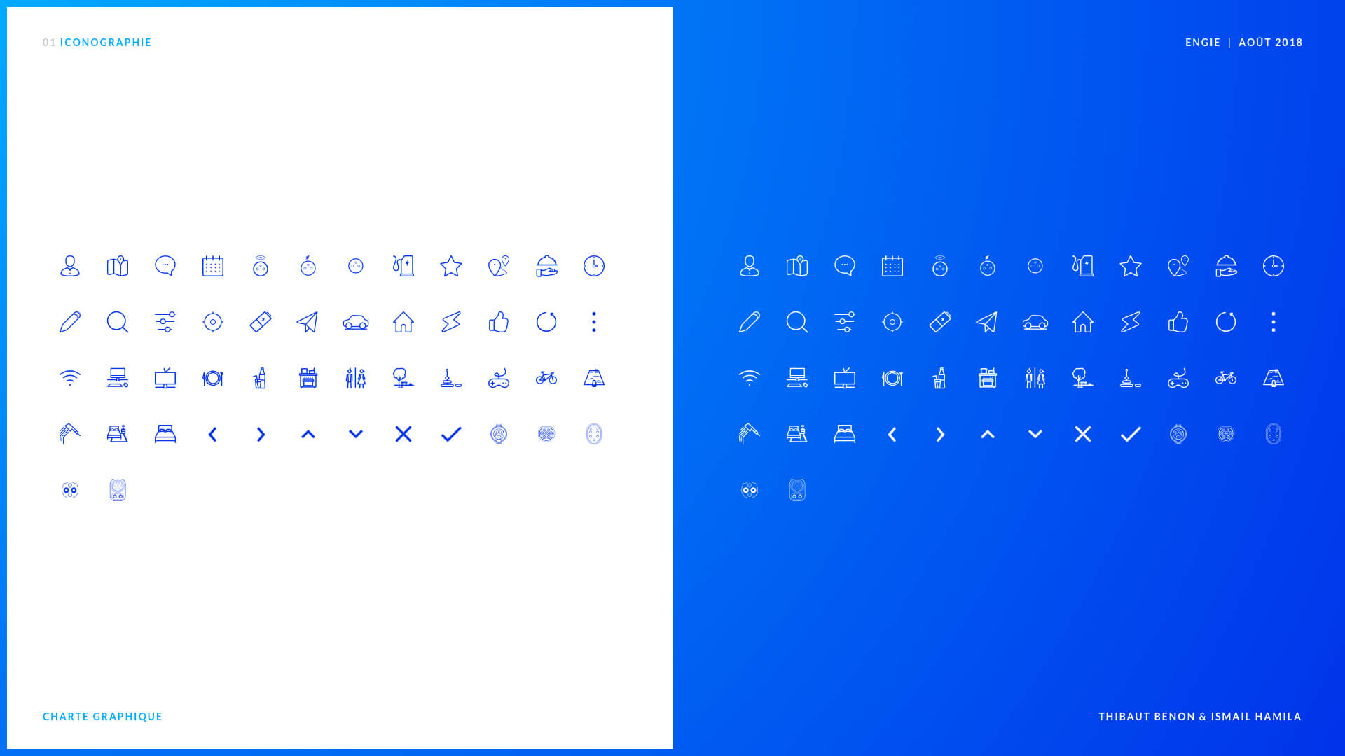
- Icons
- Wireframe creation and visual design iterations
- Backlog initialization
-
W4_Prototype/Strategy
- Mockups
- Backlog refinement
- App versioning for iterative rollout
- Growth strategy
-
W5_Prototype/Strategy
- Iterations on mockups
- Prototypes
- Final documentation
- Presentation materials
- Showcase website mockups
-
W6_Closing
- Showcase website content writing
- Handover
- Final documentation
- Presentations to business units
- Project exports
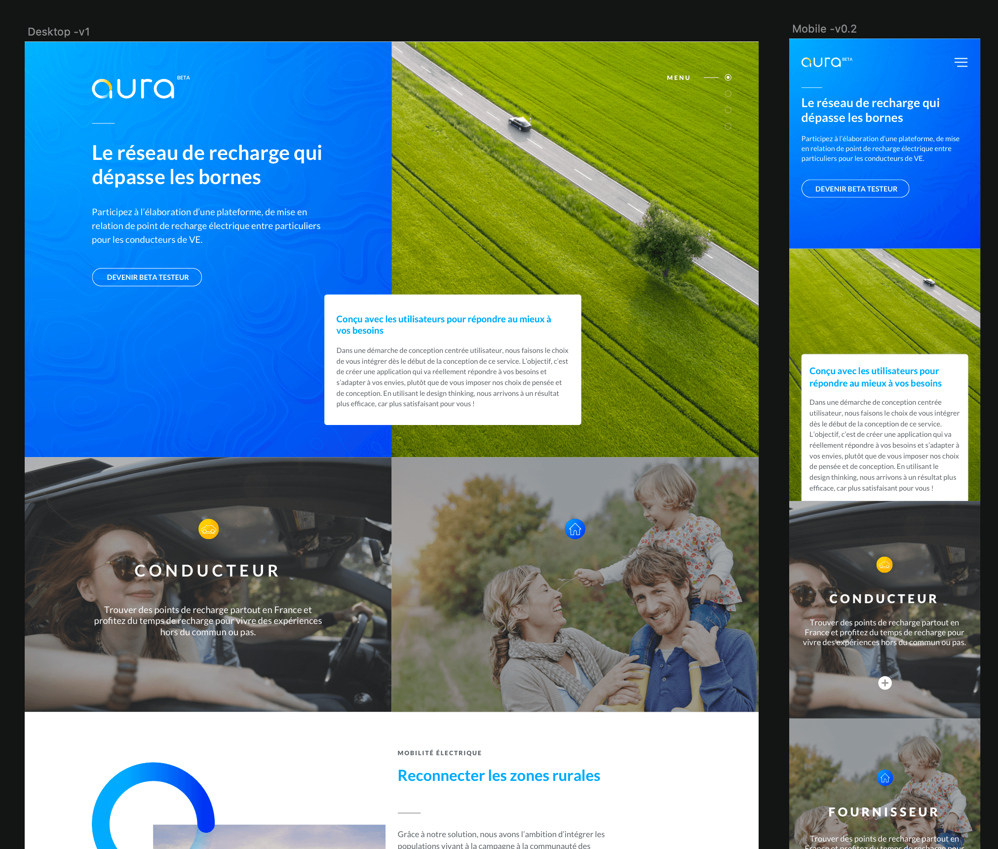
Solutions - Aura
Building the MVP: A User-Centered, Scalable Approach
To design a relevant and effective service within the constraints, we focused on delivering a Minimum Viable Product (MVP). The objective was clear: create a seamless experience by leveraging the electric mobility ecosystem (car, charging station, connected plug, cable, and phone). The MVP needed to address the needs of two primary user profiles:
- The electric car driver – searching for and booking charging points.
- The energy provider – sharing access to their private charging stations.
We began by dedicating the first week to exploring the ecosystem further and refining the concept. While new user research wasn’t possible, we conducted competition analysis and immersion visits to car dealerships to better understand pain points. This approach helped us compensate for incomplete initial data and align closer to user realities.
As Service Designer and Product Manager, I structured the project around clarity and scalability. I first established the Information Architecture, creating a foundation for organizing content and features logically. I also led the identification and prioritization of the key features for the MVP, ensuring we focused on essential functions that could validate the service’s value with minimal effort. This prioritization allowed us to maintain the project's pace without overloading development.
To keep the team aligned, I took charge of transforming these prioritized features into a structured backlog. I co-wrote EPICs and User Stories, translating the product vision into actionable tasks for the team. Collaborating closely with the UI Designer, we worked in sync, reviewing progress daily to ensure consistency between design and functionality. This iterative rhythm allowed us to design, validate, and refine each feature effectively, staying within the tight project timeline.
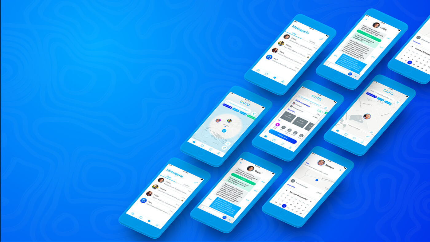
The MVP’s core features included:
- Registration and account setup to onboard both user profiles.
- Charging point creation and availability management for energy providers.
- An interactive map for locating nearby charging points.
- A booking system (without payments in the MVP) to facilitate reservations.
- Messaging functionality for communication between drivers and providers.
- Feedback and reporting tools to improve station usage.
By maintaining focus and agility, we ensured the MVP addressed the immediate user needs while laying the groundwork for future iterations.
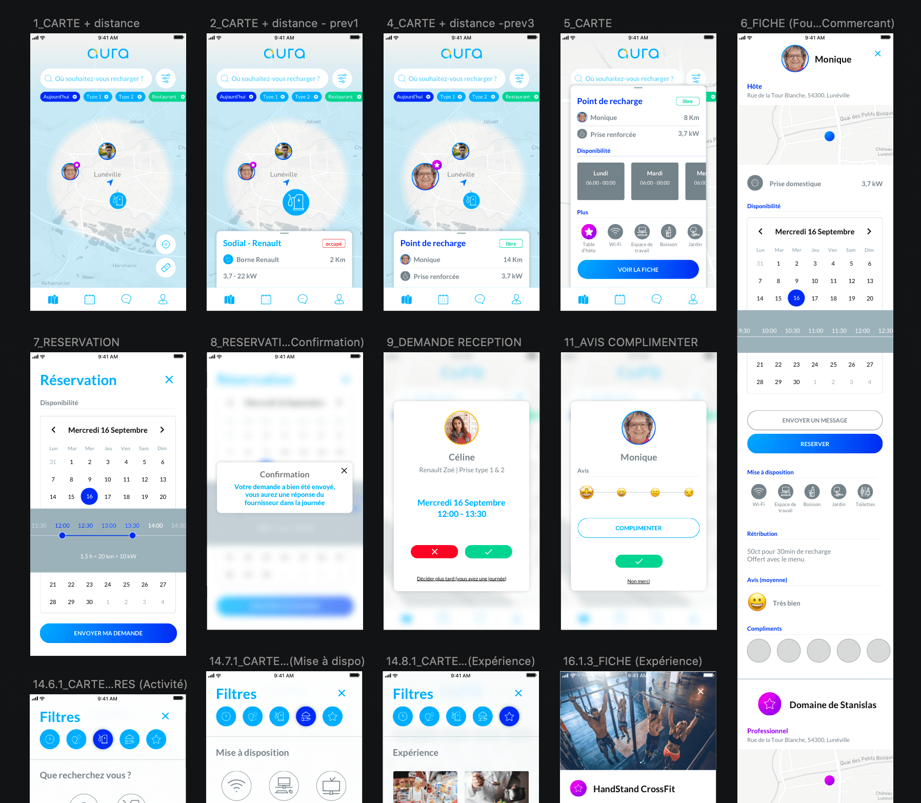
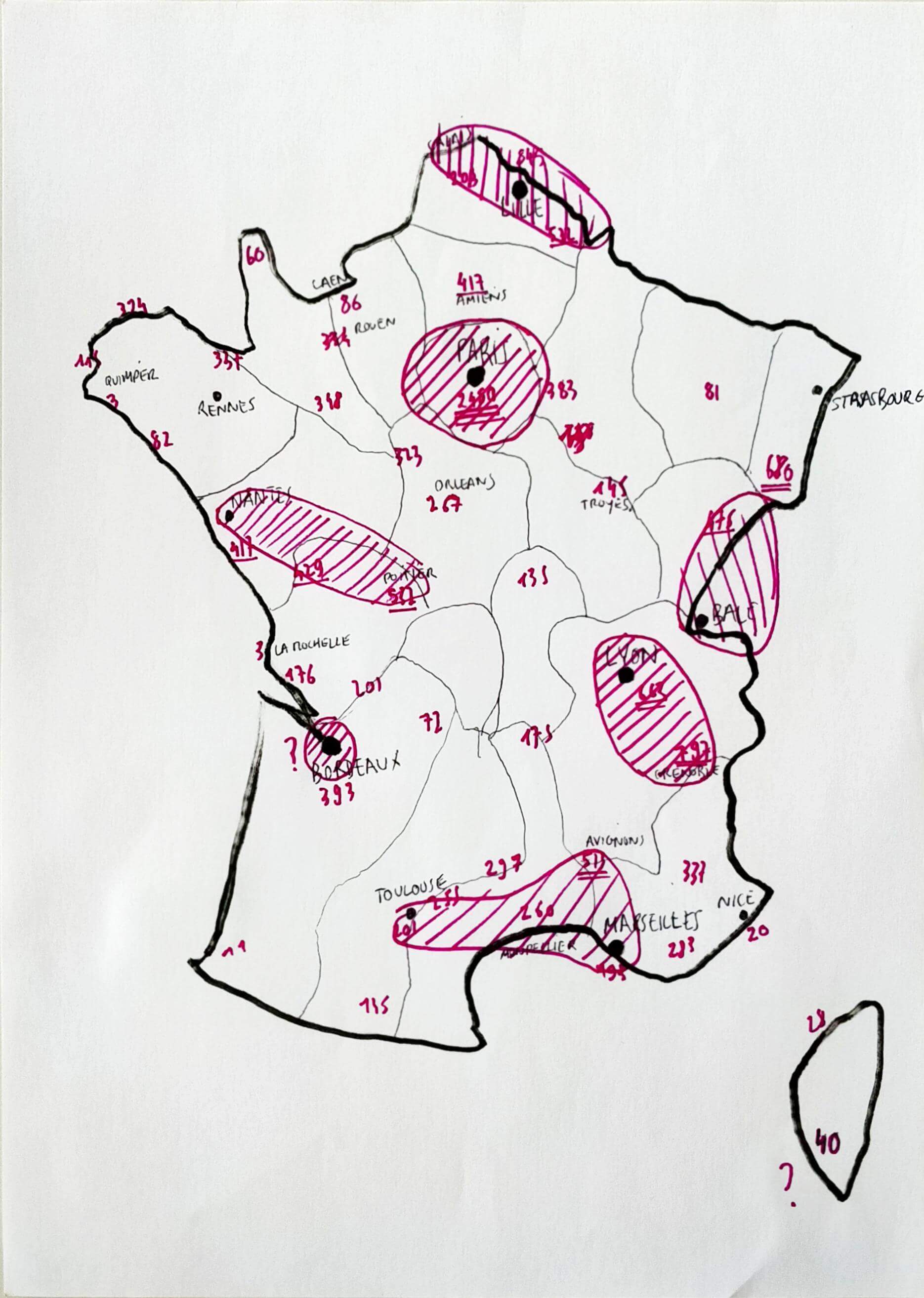
Service Design Meets Growth Strategy
While technological and market limitations required us to postpone certain features, we embedded long-term scalability and business impact into the design. Our approach combined service design principles with a clear growth strategy, addressing both user needs and market opportunities.
Technically, the ecosystem of charging stations, devices, and data formats was fragmented. Collaborating with Engie’s technical teams, we designed an API layer to standardize data flows, ensuring seamless communication between systems and future scalability.
On the strategic side, we identified a key opportunity in rural and suburban markets, which were underserved while EDF dominated urban areas and highways. EV adoption in these regions faced two major barriers:
- Limited range for long-distance travel.
- Long charging times with few nearby services.
By leveraging Engie’s partnerships with municipalities, local businesses, and its national network, we turned these challenges into opportunities. Our vision transformed waiting time into quality time for drivers, allowing them to:
- Rest in welcoming local settings.
- Discover and consume regional products and experiences.
This approach aligned with modern sustainability trends, promoted slow tourism, and delivered strategic value to Engie by expanding its influence into untapped regions.
The backlog was structured into batches and iterations, prioritizing key features for the MVP while planning for future scalability. By balancing user-centered design with Engie’s strengths, we laid the groundwork for a solution that addressed immediate needs while supporting long-term growth.
Results
The MVP we delivered met its immediate goals: it addressed core user needs, showcased Engie’s innovative approach to electric mobility, and provided a solid foundation for future iterations. However, despite the product’s potential, Engie’s leadership decided to withhold it from the Paris Auto Industry Exhibition, citing concerns about idea protection in a highly competitive market.
While this decision reflected the innovation of the project, it also revealed internal challenges within Engie’s organization. The opportunity to capitalize on first-mover advantage in underserved rural markets was missed, and the momentum we built around the service remained unutilized.
To turn this setback into an opportunity, I pivoted my efforts in the final phase of the project. I spent the remaining time pitching the MVP to various French and Belgian business units within Engie, advocating for its adoption and scaling. The goal was to find the right team to take ownership of the project, produce it, and bring it to market.
Ultimately, this project demonstrated the importance of aligning design, strategy, and organizational vision. Despite the obstacles, we delivered a well-researched, scalable solution that showcased the power of user-centered design and service thinking to address both user frustrations and business growth opportunities. Whether this vision will come to life remains an open chapter, but the work laid a clear roadmap for its future success.
Delivrables
- Workshops
- Design Sprint
- Personas
- Customer Journey Map
- Information Architecture
- Priority Guides
- Wireframes
- Mockups
- Interactive High-Fidelity Prototype
- User Tests
- UI Kit
- Strategic Recommendations
- Backlog
