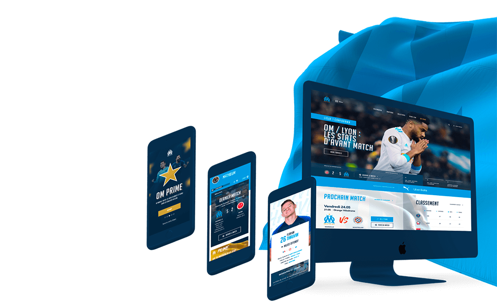
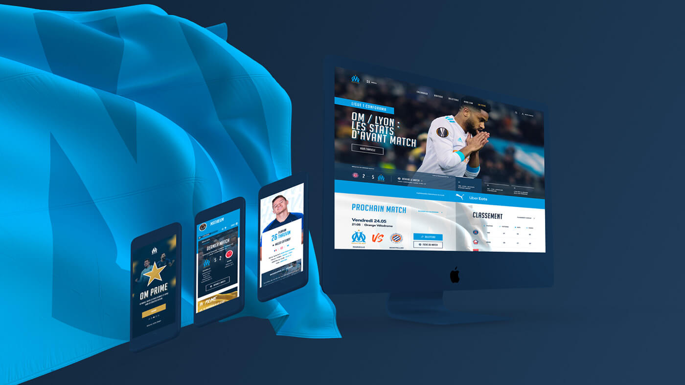
OM - Bridging Legacy and Innovation
A renewed digital presence for an iconic football brand.
 < Prev
Case 05 / 06
Next >
Context & Goals
Olympique de Marseille, one of France’s most iconic football clubs, approached us with a bold challenge: to reinvent their digital presence and create a platform that could bridge the club’s rich heritage with modern digital expectations. With a diverse and passionate fan base spanning the globe, the existing website struggled to meet the needs of today’s users.
The primary objectives of this project were twofold:
- Enhance the fan experience – Create an engaging, user-friendly platform that offers a seamless journey for supporters, from match updates to ticket purchases.
- Modernize the brand online – Develop a digital ecosystem that reflects OM’s storied legacy while embracing innovative design and technology.
At its core, the project aimed to establish OM as a digital leader among football clubs, building a stronger connection between the club and its fans while creating a scalable, future-proof foundation for growth.
Team & Stakeholders
- 1 Product Designer
- 2 UI Designers (1 for the Website & 1 for the App)
- 1 Consultant
- 1 Project Manager
- 1 Product Owner at Olympique de Marseille
- Development Team
Timing
- Mai-Jully 2019
- 10 weeks of Design
Responsabilities
Product Designer / Owner
- Information Architecture & Site Map
- Ergonomic Improvements
- Experience Design
- User Research Advisor
- Design Backlog Creation & Management
- Backlog Contributor
Problematic & Challenges
The project began with a tight timeline: the OM team approached us in March, aiming to launch the first version of their new website by July, just in time for the football season. This introduced significant challenges around time management and prioritization. We needed to balance what users would find most valuable with the key objectives of the client—ensuring that fans could easily access essential features and content.
The critical questions were clear:
- How can we organize our team to deliver high-quality materials within such a tight timeframe?
- How do we prioritize content and features effectively to meet both user and client needs?
Additionally, the logistics of the project posed its own set of challenges. With Emakina operating out of Paris and Limoges, and OM headquartered in Marseille, most of the communication had to be handled remotely, requiring careful coordination.
Finally, a major brand challenge emerged: How do we broaden OM's appeal beyond their traditional football-focused fan base, expanding into a wider community aligned with their new vision? The rebrand emphasized "OM Nation," a community-centric identity that aimed to unite loyal football enthusiasts while inviting a new, more diverse audience into the fold.
Timeline
-
W1_Concept/website
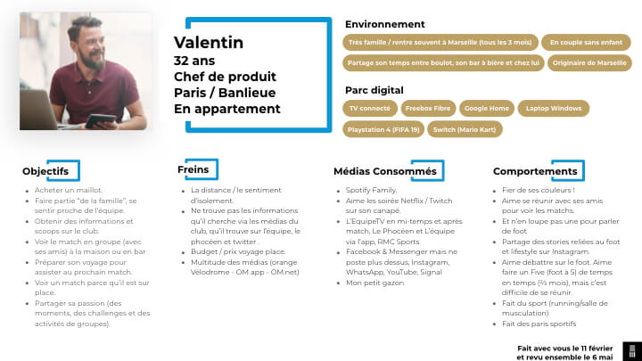
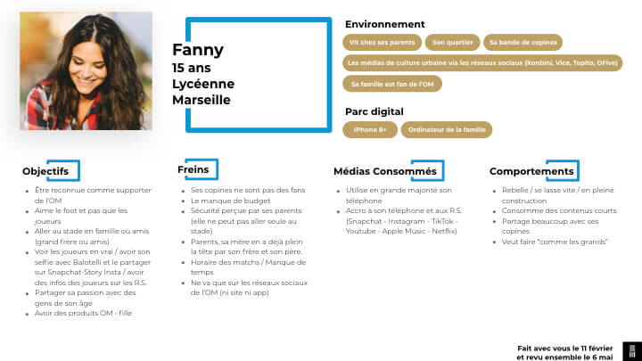
- Creation of personas
- Typography benchmarking (international use)
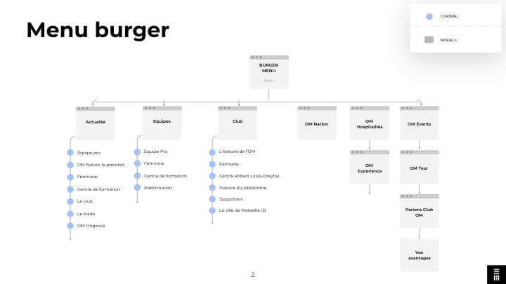
- Arborescence/Wenu for the website
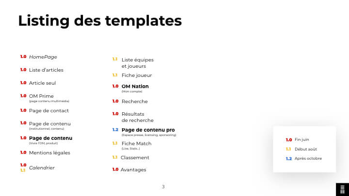
- Listing templates (Website)
- Batch versioning (Website)
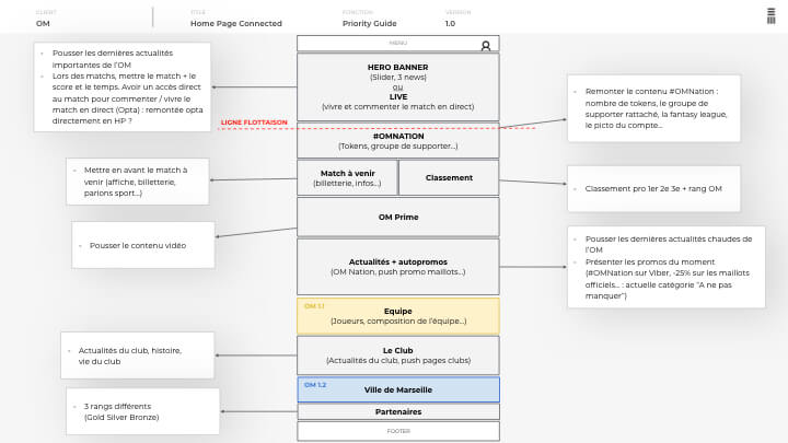
- Priority guides (Website)
-
W2_Prototype/website
- Iteration on priority guides (Website)
- Backlog creation for the website
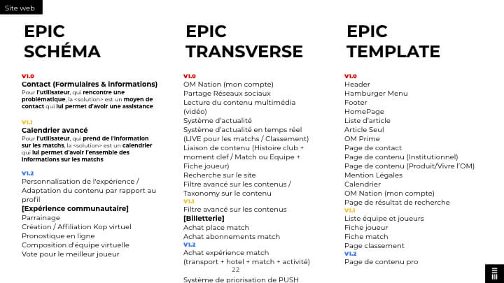
- Themes & Epics
- User story templating
- First drafts of mockups (Website)
-
W3_Prototype/website
- Refinement of priority guides (Website)
- Finalization of the information architecture (Website)
- User story writing and backlog updates (Website)
- Updated mockups (Website)
-
W4_Prototype/website+app
- Survey conducted to build additional personas
- Continued backlog updates/User story writing (Website)
- Mockup updates (Website)
- Initial website development progress
- Arborescence/Wenu creation (App)
- Listing templates (App)
- Batch versioning (App)
-
W5_Prototype/app
- Creation of priority guides (App)
- Backlog creation for the app
- Themes & Epics
- User story templating
- Initial drafts of mockups (App)
-
W6_Prototype/app
- Refinement of priority guides (App)
- Finalization of the information architecture (App)
- User story writing and backlog updates (App)
- Mockup updates (App)
-
W7_Prototype/website+app
- Iterations on website mockups
- Refinement of priority guides (App)
- Updates to the app's information architecture
- Additional mockups for the app
- Asset production for the app
-
W8_Finalization
- Final app mockups
- Completion of asset production for the app
Solutions
Adopting a Product-Centric Workflow
At Emakina, we adopted a co-design approach tailored to the tight timeline of this project. Instead of the typical sprint-based method, we shifted to a product-centric workflow, enabling faster iterations and continuous alignment. Collaboration with OM’s Product Owner (PO) was structured around batch deliveries, allowing the client to review progress incrementally.
To streamline the process, I extended my role beyond UX to include backlog management, co-writing EPICs, and User Stories. This reduced the workload for both the PM and PO, ensuring the team could focus on critical priorities. We also took a step back to refine personas and conducted an international survey to prepare for future adaptations targeting Arabic and Japanese markets. With this foundation, we launched the website design phase, balancing legacy content with OM’s new brand vision.
Redesigning the Website: Prioritizing Agility and Impact
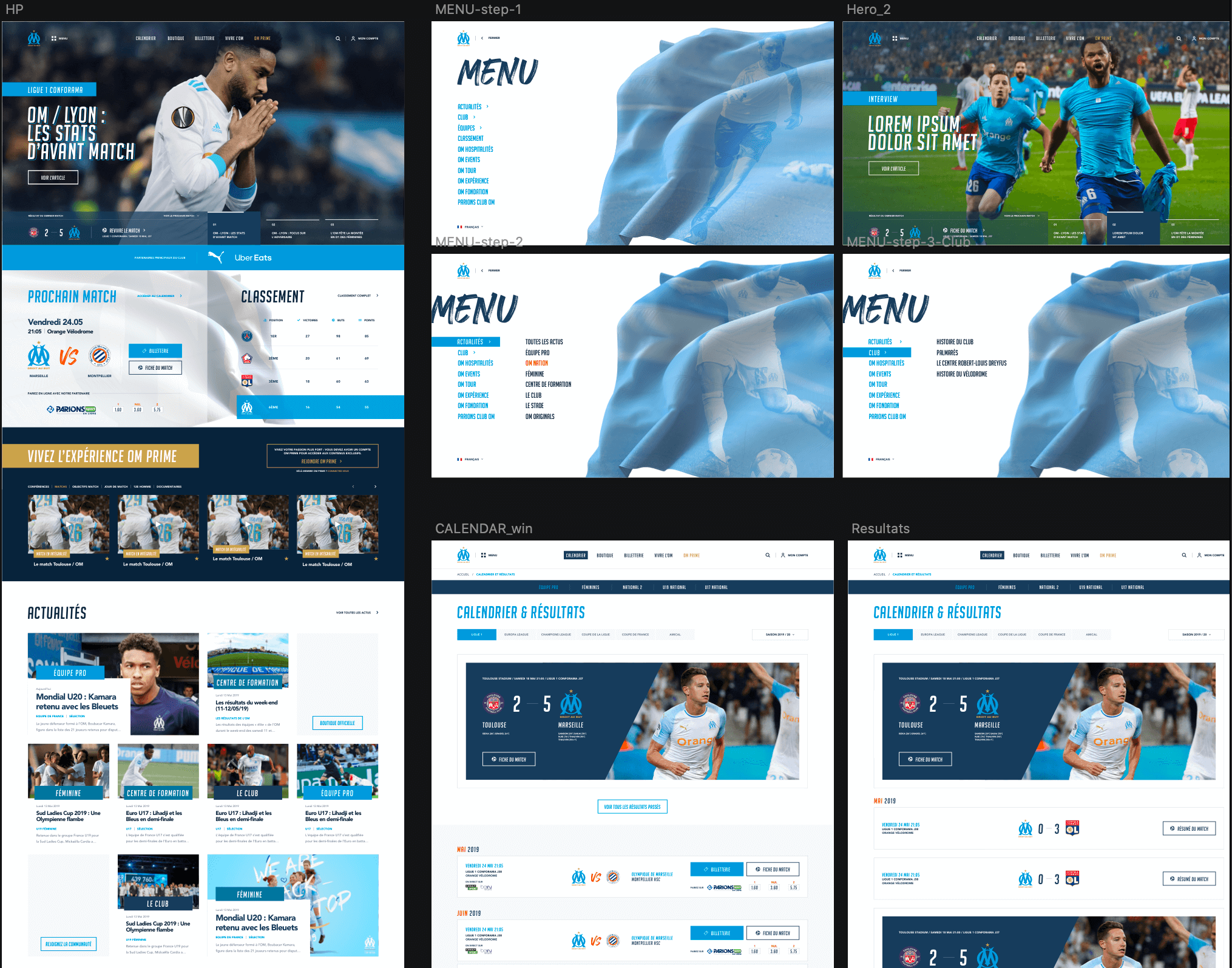
The website redesign phase was driven by the need to modernize OM’s digital presence while addressing the immediate requirements of a phased delivery. The process began with restructuring the information architecture to establish a scalable foundation. This ensured that new content and features could be seamlessly integrated while maintaining clarity for users.
To accelerate the design process, we utilized Priority Guides instead of traditional wireframes, focusing on content and functionality rather than rigid layouts. This allowed the UI designer greater creative freedom and ensured quick iterations. Each design batch represented a versioned release of the website, validated at multiple stages with OM’s Product Owner and technical stakeholders.
As part of this iterative process, I wrote and refined EPICs and User Stories for the backlog, aligning development priorities with the needs of OM’s diverse user base. The result was a streamlined and user-centered website that not only showcased OM’s rich legacy but also reflected its ambition to engage a global audience.
Expanding to Mobile: A Platform for Engagement
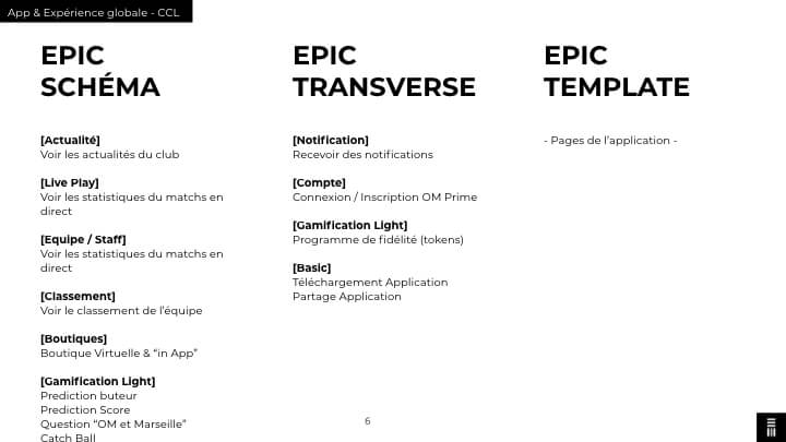
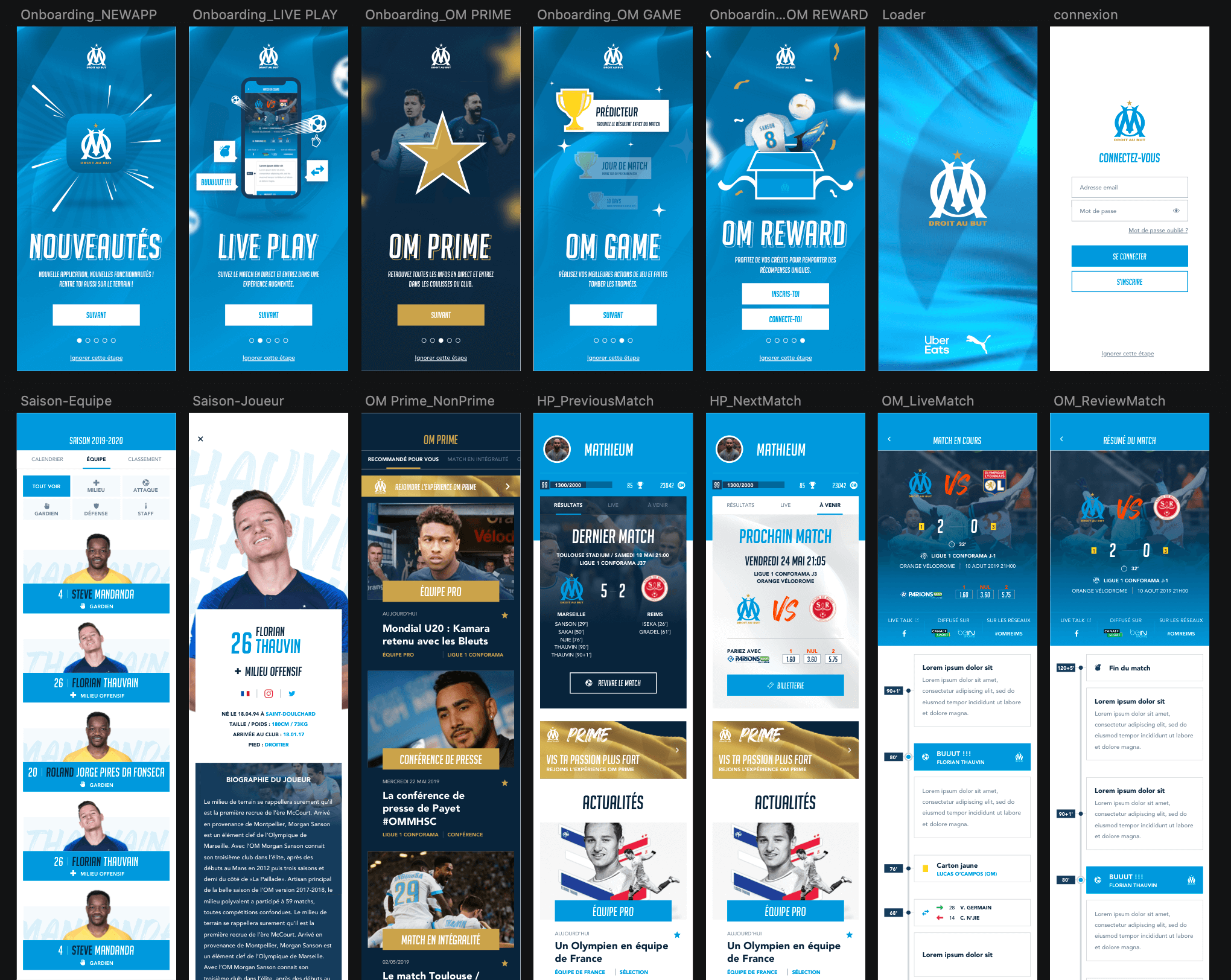
Once the website design phase was complete, we shifted focus to the mobile application, building upon the foundation laid during the website’s development. The app was envisioned to complement the website, prioritizing mobile-specific behaviors and features like gamification, loyalty rewards, and real-time match updates to drive community engagement through OM Nation.
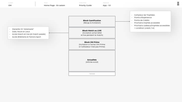
The design process began with wireframes to accelerate progress, leveraging the content and structure established during the website phase. However, feedback from the Product Owner revealed a disconnect from the co-creation process. To address this, we reverted to Priority Guides, fostering collaboration and reestablishing trust among the team.
Although a junior UI designer led this phase, the transition was seamless due to strong support from the initial UI designer and close alignment with the broader team. This approach ensured consistency in design quality and allowed us to deliver an app that complemented the website while focusing on the unique needs of OM’s mobile-first audience.
Results
The project culminated in the launch of a revitalized website and a near-complete mobile application, set to release shortly. Together, these platforms represented a cohesive digital ecosystem that bridged OM’s storied past with its innovative future.
For OM, this digital transformation reinforced its position as a modern, fan-focused football club while expanding its reach to international markets. For Emakina, the project highlighted the power of agility, co-design, and product-centric workflows in delivering impactful solutions under tight constraints. By aligning brand vision with user needs, we crafted a digital presence that not only served existing fans but also paved the way for OM’s long-term global strategy.
Delivrables
- Workshops
- Design Sprint
- Personas
- User research survey
- Consumer journey map
- Information Architechture
- Priority Guides
- Wireframes
- Mockups
- Interactive Prototype
- UI Kit
- Recommandations
- Design Backlog
