Empowering Nike Retail Teams
Transforming Retail Experiences Through a Seamless PWA
Context & Goals
Nike’s EMEA Marketplace Development team approached Emakina to modernize their City Retail Tours—2-3 day visits by Nike’s top management to strategic “Key Cities.” These tours gather insights on retail performance, market trends, and product impact across both Nike-owned stores and retail partners like Courir and Go Sport.
At the time, the process relied on printed, stapled documents, which were outdated and cumbersome for such a dynamic and data-driven activity. The goal was to replace this with a Progressive Web Application (PWA) to streamline and enhance the tour experience, ensuring that employees and management could work seamlessly. By focusing on refining the employee experience, Nike aimed to elevate the brand experience, reinforcing their leadership in retail innovation.
Team & Stakeholders
- 2 UX Designer
- 1 UI Designer
- 1 Consultant
- 1 Planner Strategist
- 1 Projet manager
- 5 Developers
- 1 Product Owner from Nike
Timing
- February-March 2019
- 5 weeks of Design
Responsabilities
Lead UX Designer
- Arboresance & Information Architechture
- Ergonomy
- Experience design
- Wireframing
- User tests
- Recommendations
Problematic & Challenges
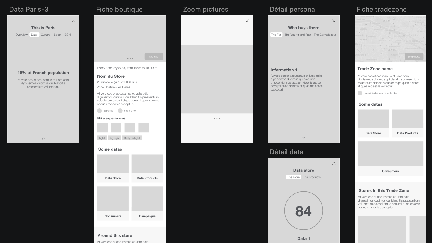
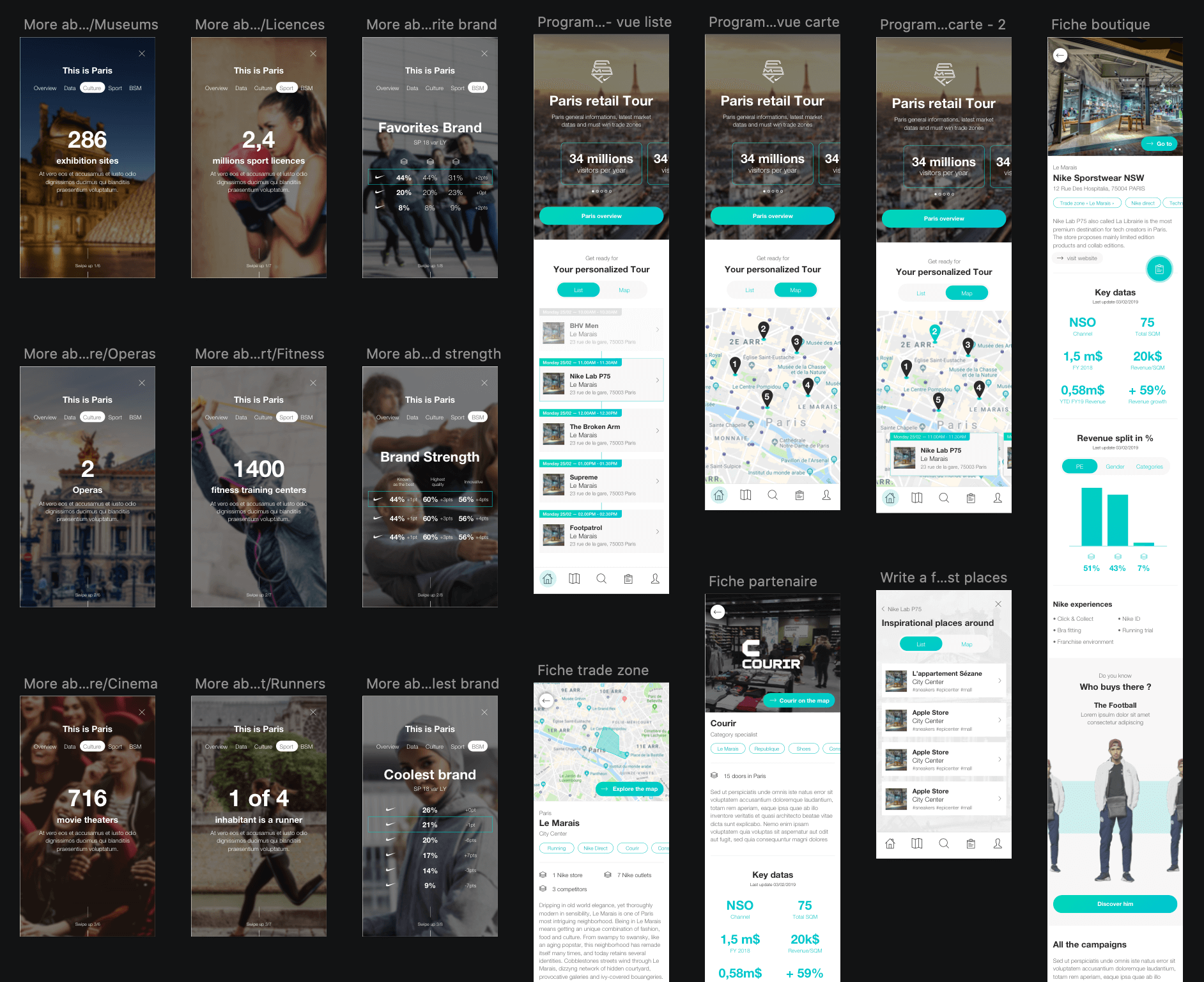
The Paris Retail Guide was Nike’s primary resource for City Retail Tours—a comprehensive document containing detailed information about stores, trade zones, and consumer insights in Paris. However, the guide was delivered as a 200+ page static PDF, which posed significant issues for both City Tour Managers and visitors (Nike’s top management and partners).
For visitors, navigating the guide was cumbersome, making it difficult to find relevant information quickly. For City Tour Managers, the PDF was time-consuming to update, challenging to evolve, and ultimately underutilized. The existing format was inefficient and didn’t meet the needs of either group.
The solution was clear: Replace the PDF with a dynamic, scalable tool to provide a better experience for both user groups. Key features included:
- For visitors: Access to city and tour information, with the ability to leave feedback.
- For City Tour Managers: The ability to create tours and keep information easily updated.
However, implementing this solution came with several key challenges:
- On-the-go accessibility: Visitors often lacked consistent connectivity or a local carrier while traveling, requiring offline functionality and timely information delivery.
- Dual persona support: The app needed to serve both visitors and City Tour Managers equally well, balancing their distinct needs.
- Scalability and adaptability: The tool needed to scale effortlessly across other Key Cities worldwide while accommodating cultural differences and adapting the interface accordingly.
By addressing these challenges, the solution would transform how Nike’s City Retail Tours were organized and experienced.
Timeline
-
W1_Concept
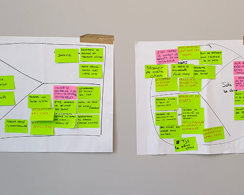
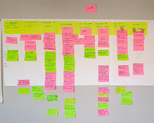
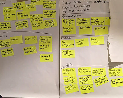
- Creation of foundational deliverables (co-created with stakeholders):
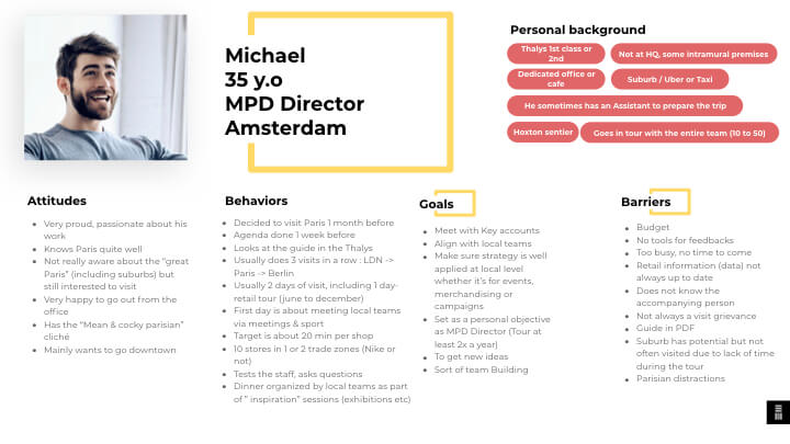
- 2 Personas
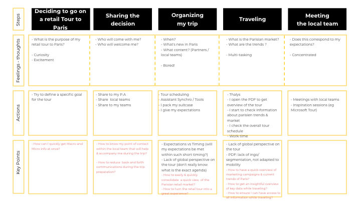
- 2 Customer Journeys
- 2 Value Proposition Canvas
- Identification of:
- Key Challenges
- Design Backlog
- 2 User Flows (app)
- Development of Priority Guides to define interface priorities.
-
W2_Prototype
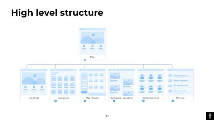
- Information Architecture setup.
- Iteration and refinement of:
- User Flows
- Priority Guides
- Creation of:
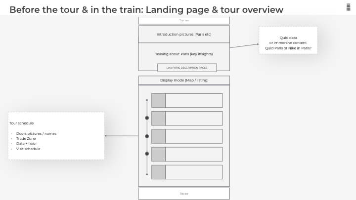
- Initial Mockups
- Prototypes
-
W3_Prototype
- Iterative refinement of:
- Mockups
- Prototypes
-
W4_UserTest
- Conducted using InVision and Lookback tools.
- Deliverables included:
- Test Protocol
- Contextualized Prototypes for real-world scenarios
- Survey Design
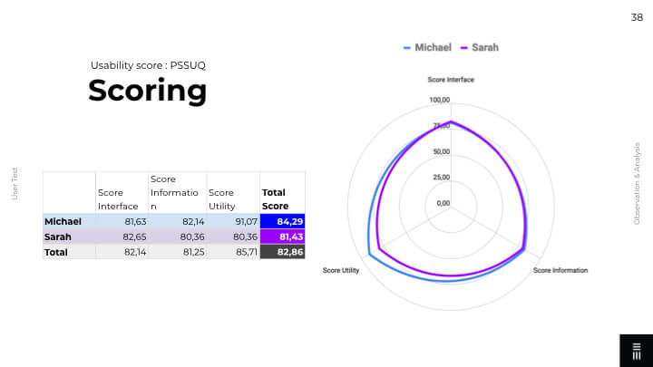
- PSSUQ Scoring (Post-Study System Usability Questionnaire)
- Recommendations for improvement
- Review and updates to the Backlog based on findings
-
W5_Iteration&Deliver
- Final iterations on:
- Mockups
- Prototypes
- Presentation of the first glance at the PWA (Progressive Web App).
Solutions
A Co-Designed PWA for Seamless Retail Tours
At Emakina, we worked closely with Nike’s teams using a co-design approach to create a solution that met their needs. Our process was based on iterative sprints, similar to the GV Design Sprint, with cycles lasting one to two weeks. Nike’s team actively participated for three days during each sprint, allowing for continuous collaboration and alignment.
The design team included two UX designers and one UI designer, with regular support from the technical team to ensure feasibility and input from consultants to align business and design objectives. This collaborative approach worked exceptionally well because Nike’s team was fully committed to the process. Together, we explored numerous ideas and landed on a clear solution: a Progressive Web Application (PWA) tailored to their needs.
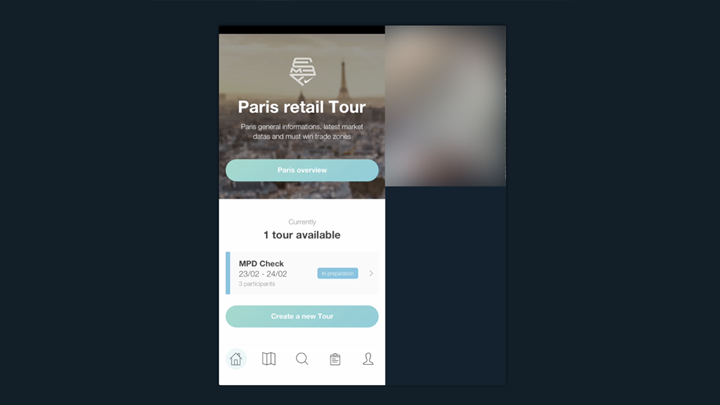
- City Tour Managers: They can create and manage tours across Nike and partner stores and update city-specific data.
- Visitors: They can easily access information about the city, consumers, and market trends, and provide feedback about the stores they visit.
To address real-time needs during tours, we added a geolocated notification system. For iOS users, where certain PWA features are not yet supported, we implemented an alternative by linking the notifications to the tour schedule.
Iterative Design Through User Testing
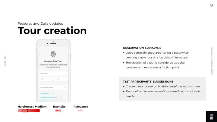
After several iterations by following the agile creative process during the ideation and the first wireframes, we generated plenty of ideas through the design sprints that we had to prioritise. Thanks to the constraints that we had to deal with, like limited time and resources, we stayed in an MVP the scope. After converging it organically by prioritising the features with the Emakina and Nike teams, we managed to run user tests within the given time and budget to validate the MVP and lock the scope of it. The test was passed on 2 persons of each role (2 City Tour Managers and 2 future visitors) three in English and one in French. Since the journeys are just slightly different (one creates the tour, the other consumes it) and could have another qualified user, we considered that 4 testers were enough to cover almost 80% of the usability problems (according to Thomas K. Landauer and Jakob Nielsen with an average of 31% of usability errors on the total by users). And the results of the tests were really satisfying as it confirmed our design (with some small modifications on the UI) and led us to a better prioritised backlog based on user feedback.
Results
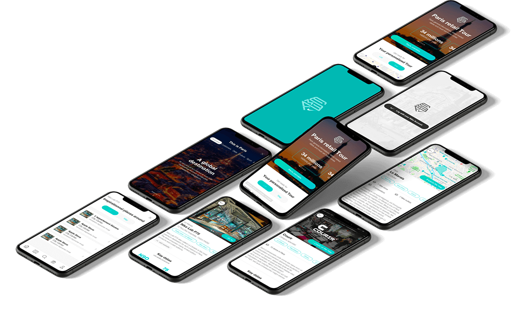
What started as a static tour guide PDF transformed into a fully interactive Progressive Web Application (PWA), offering a seamless and engaging experience for Nike’s City Tour Managers and visitors. The application is responsive, allowing for effortless use on desktops during tour creation and providing a dynamic, on-the-go experience for visitors during their tours.
The feedback from Nike’s teams was overwhelmingly positive. The PWA not only met the initial objectives but also opened doors to broader possibilities. Nike is now considering deploying the solution to other key cities globally and iterating on the product based on the prioritised backlog. This scalability and adaptability mark a significant step forward for their retail development strategy.
For us at Emakina, this project was more than delivering a solution—it was about co-creating a product with a clear organisational vision. By leveraging a co-design methodology, we exceeded expectations, delivering a tool that refined Nike’s brand experience by empowering its internal teams and enhancing the retail tour process.
Delivrables
- Workshops & Co-creation Sessions
- Design Sprint
- Personas
- Consumer Journey Maps
- Information Architecture
- Priority Guides
- Wireframes
- High-fidelity Mockups
- Interactive Prototypes
- User Testing Protocols & Insights
- Design System Foundations
- Strategic Recommendations
- Prioritised Design Backlog