Engie - Service Design
Creation of a charging station sharing service within the brand ecosystem
 < Prev
Case 03 / 03
Next >
Context & Goals
After this crazy competition adventure, some mail, phone exchanges and a deal closed, we began with my UI Designer fellow at the end of July, for 28 working days, to work and ship an MVP of the car charging station sharing service. If Engie selected us to work on this project, it was because the concept was close to an idea that they had on a Design Sprint and that they began as a project. Project on which they did some user research, based only on people who work at Engie, so at my arrival I wasn’t really satisfied by the user research work, based on biased data that are not representative of the real electric mobility consumers. Beside that, the researcher didn’t go really deep into the question and the personas were extremely light and superficial, so it wasn’t real good material to reflect on. We asked if we could do a bit more of user research to deepen the knowledge and be more precise on how we would address the consumers, or at least get some relevant data on the second target, the people who will provide their plug which are suburbs and countryside people. But we hit a brick wall and didn’t get any relevant data, and got a lot of discussion based on assumptions that we never verified. The deadline was one again short, because of the fact that they wanted to present the project to the public at the Paris Auto Industry Exhibition and get testers from the real contest, which was for us a really good idea. When we landed at Engie’s office we were briefed on this project by the Head of Design and the Lead UX Designer. During the project we worked with a Lead Interactive Designer, the Head of Marketing and a Product Owner.
Team & Stakeholders
- 1 Service Designer
- 1 UI Designer
- 1 Lead Designer
- 2 Heads of (Design /Innovation)
- 1 Product Owner
- Various BU representatives
Timing
- 6 weeks Design
Responsabilities
- Team lead / Sprint master
- Information Architechture
- Ergonomy
- Experience design
- Service design
- Strategy design
- Recommendations
Problematic & Challenges
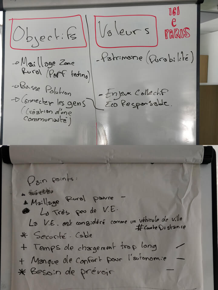
The first challenge was again the lack of relevant data, because of a lack of expertise in UX Design. So the user research, made by another freelance, took time and money were straight away biased by the panel (only 4 persons who were Engie workers and not all of them used electric car) and were missing depth of information. The second problematic was the PO, who arrived in the middle of the project, after a list of tasks was already made and prioritized. The real problem was really the timing in which he arrived but the fact that he didn’t set up any agile rituals, product process and haven’t even read any of the documentation that we wrote for handovers. All he did was asking us to do a daily meeting each morning, without any context. So the second challenge of this project was to report the right amount of information to each person of the organisation which paid us and organising ourselves, in other words, integrating the tasks of the PO in our scope. And the last challenge was to understand how the devices could communicate with each other to be precise and relevant in our designs. And this is especially the product design approach and the complexity of the ecosystem of that service that made us lend into the MVP.
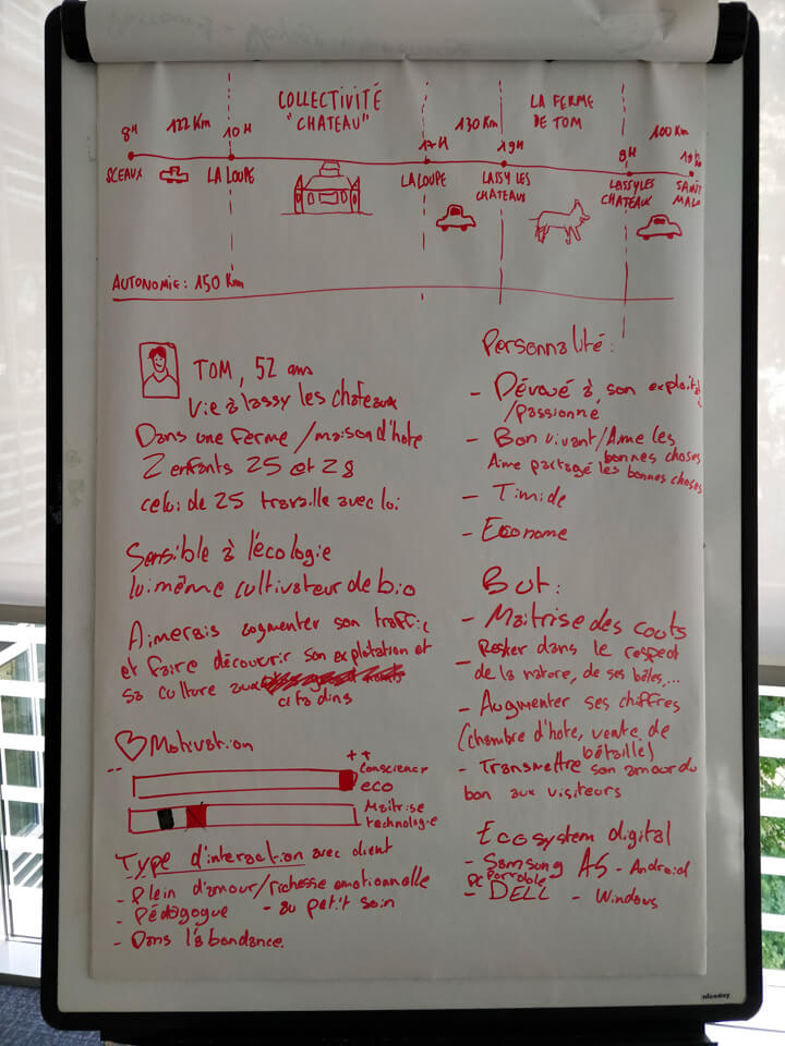
Timeline
-
W1_Initiation
- Document digestion
- Research/Immersion
- Document unification
- Personas
- Stakeholder & Decision Makers identification
-
W2_Concept
- Refining the concept & UVP
- Features listing
- User flows
- Service Blueprint
- Information Architechture
- Wireframes
-
W3_Branding/Prototype
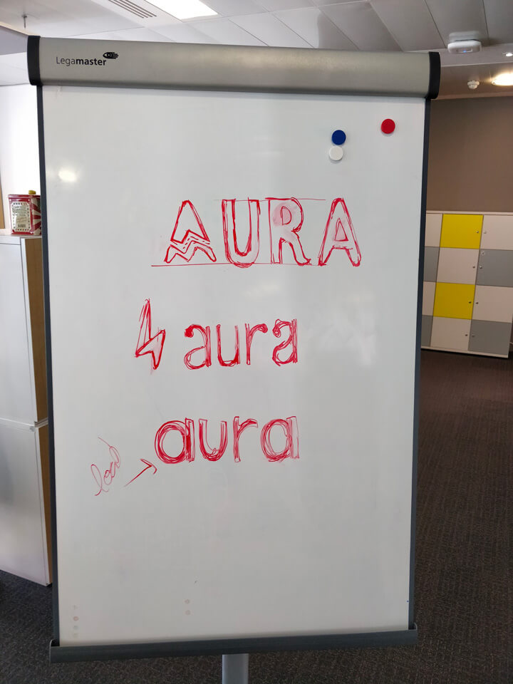
- Branding
- Brand personnality workshop
- Logo
- Colors
- Typography
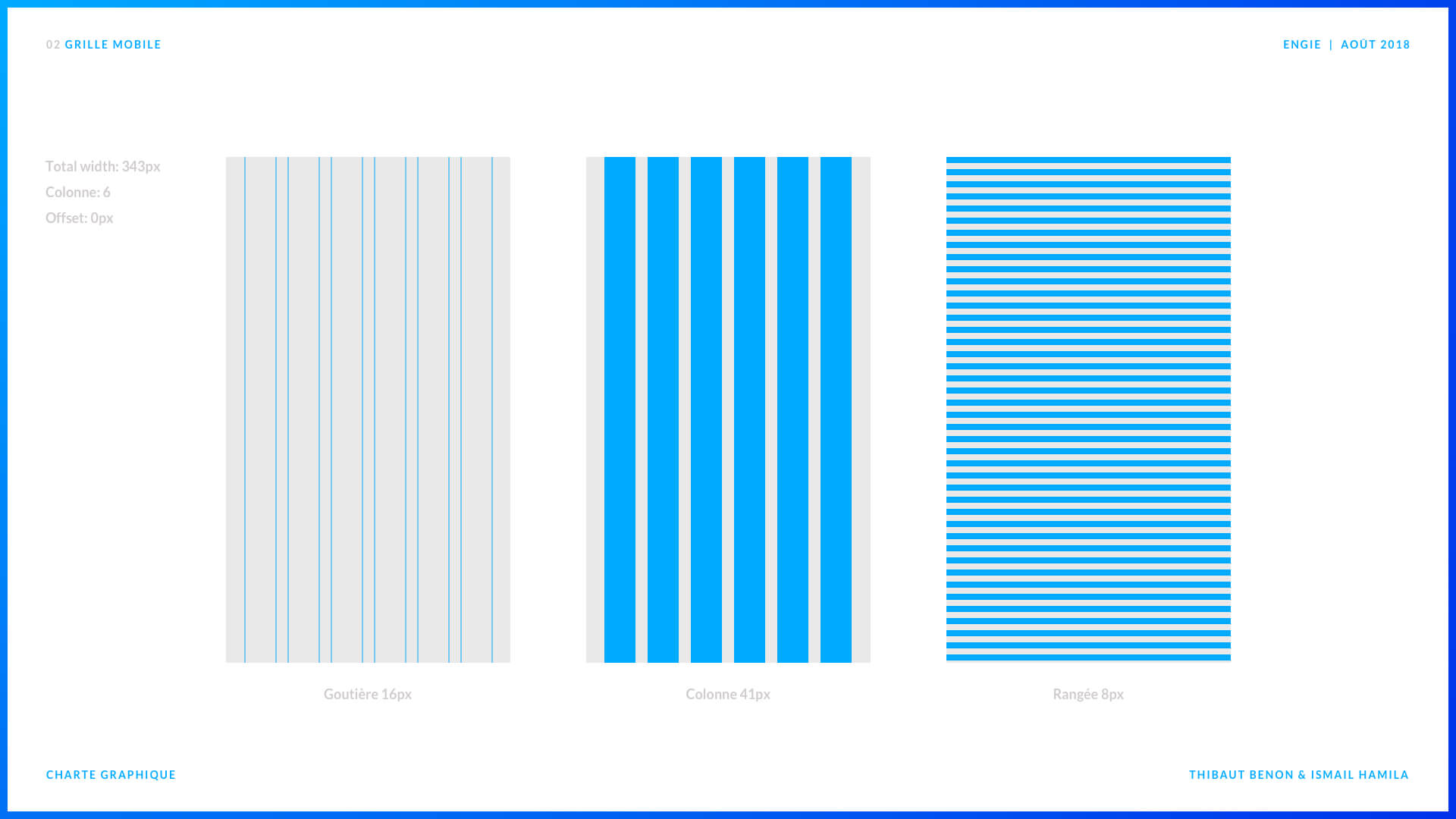
- Grid system
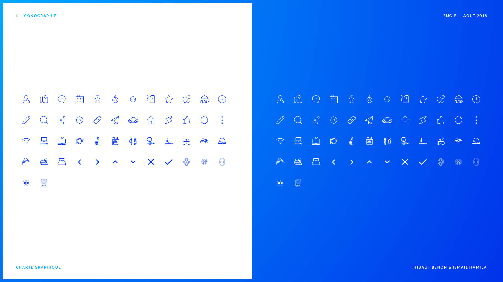
- Icons
- Wireframes
- Mockup
- Backlog initialisation
-
W4_Prototype/Strategy
- Mockup
- Backlog
- App Versionning
- Growth strategy
-
W5_Prototype/Strategy
- Iteartion on mockups
- Prototypes
- Documentation
- Presentation materials
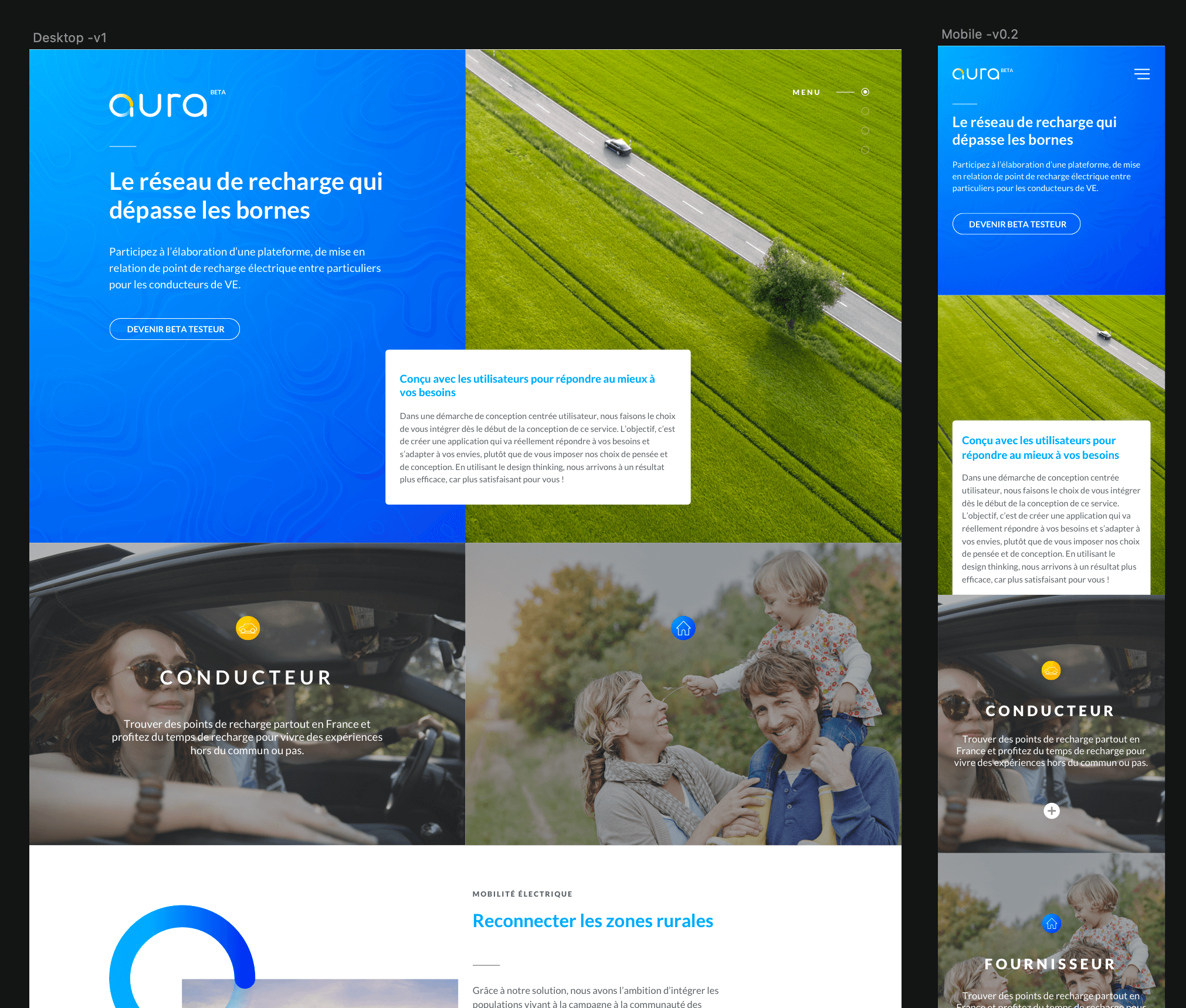
- Showcase website mockup
-
W6_Closing
- Showcase website wrinting
- Handover
- Presentation to various business units
- Finalisation of documentation
- Meetings
- Exports
Solutions - Aura
The MVP
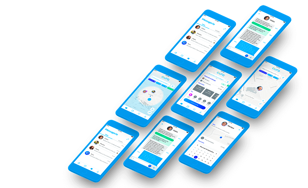
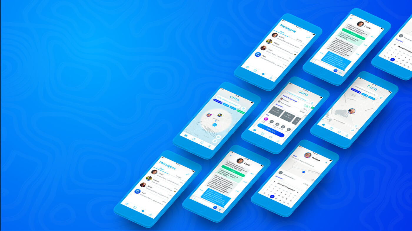
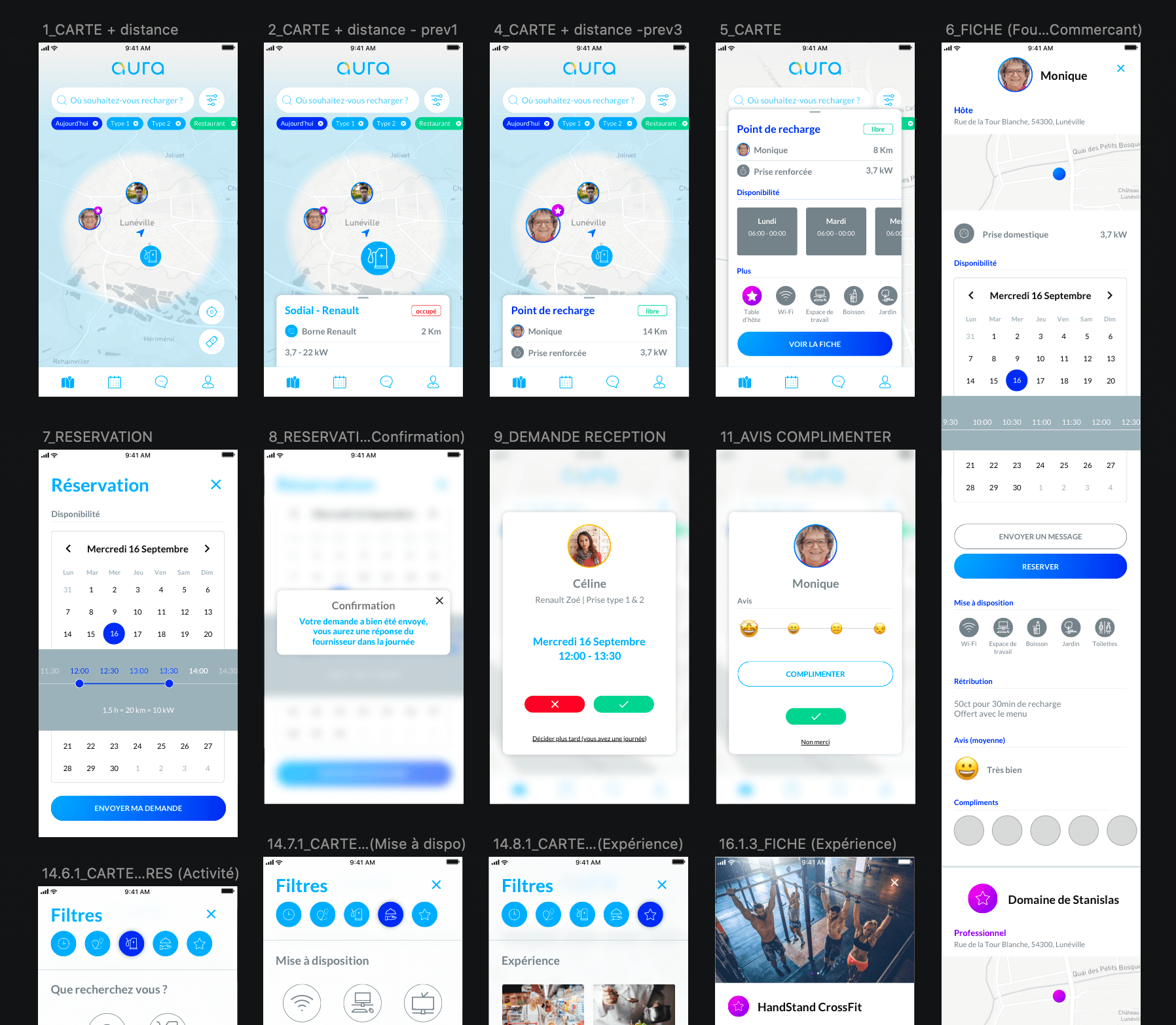
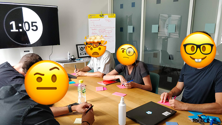
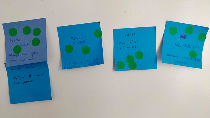
We wanted to build the best product for our future users by using the full potential of the ecosystem (car, charging station, connected plug, cable and phone) to provide a seamless experience. But in reality, to provide that seamless experience that we had in mind, we had a lot of features that needed a lot of development, features that we are not sure people will need or even use, so we focused on the key features for a Minimum Viable Product. This way we can be sure of the relevance of this freshly designed service on the market, and lower the effort and expense losses if the product doesn’t succeed in the market. This is the version of the product which will allow the brand to collect the maximum amount of validated learning about customers and the fit of each feature, this way we can kill the features that are useless, unused or unwanted and capitalize on the evolution of the ones which have the most added value for the customers. We took the first week to see if we can gather more information about the context, we chose to capitalize on our competition research for the user research and to go further on the electric mobility ecosystem by visiting car dealers. That was a good way for us to develop more empathy for the users. We built the app around two profile, the electric car driver and the energy provider, and before redesigning the app using the materials given by Engie and produced during the competition we wanted to have a clear information architecture of the app and list of features. We chose the basic features : Registration, Connexion, Filling information about the charging point and the car, Booking a charging point (without payment) with the management of the demands and availability, Interactive map, Messaging service, Feedback and Reporting. After listing all these features and defining the users using these features (Energy providers / Driver), my fellow UI Designer took back the work on the interfaces while I converted these features to User Stories. That way we exchanged a lot on our work two times a day to be sure we were aligned on the vision that we had of the product and on how we materialized the features (by word as well as visually).
Product/Service Design and growth strategyt
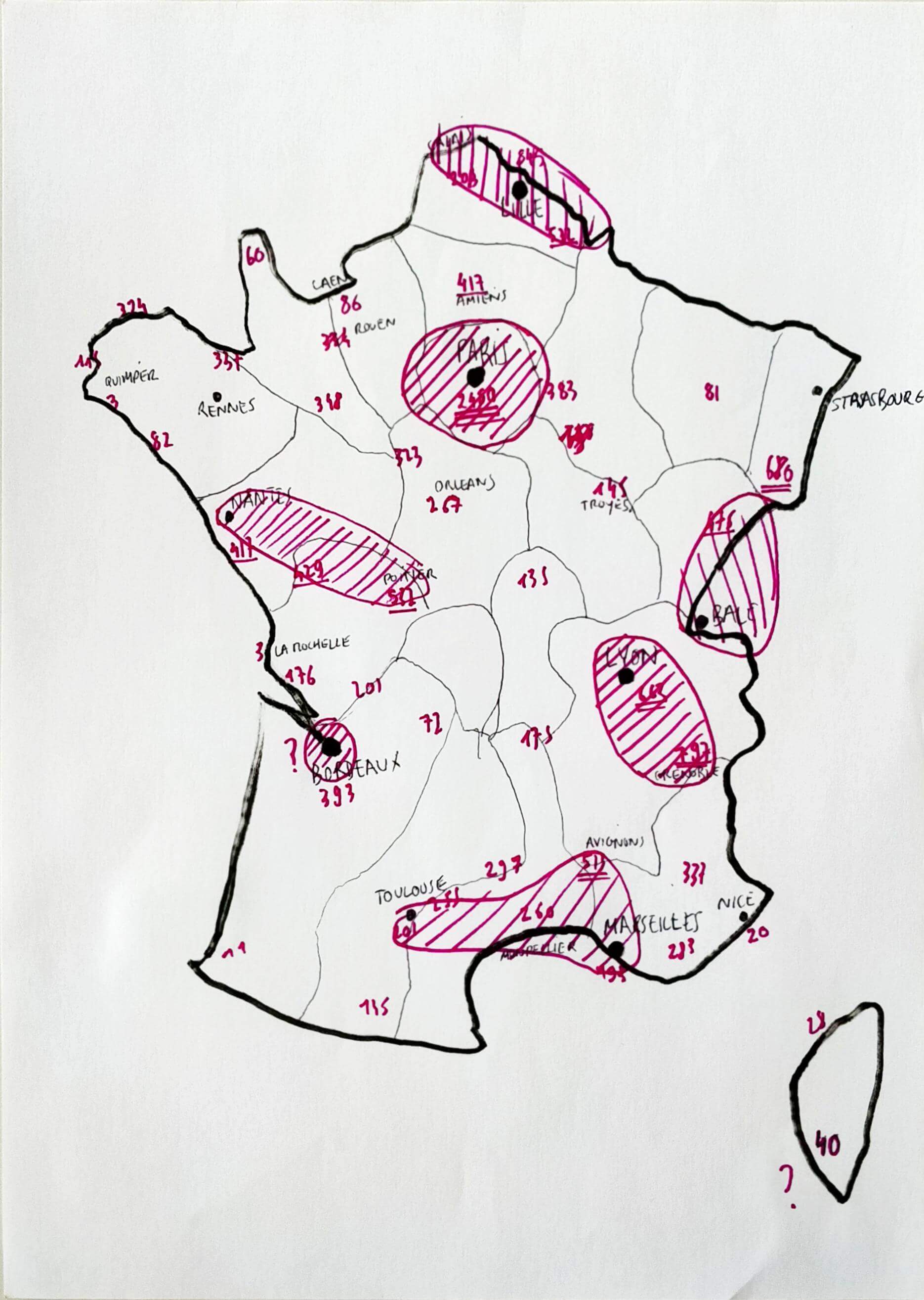
While we couldn't add all the features that we thought of and we had to prioritize them, some of the features were postponed to other versions because of technological reasons (connexion between devices). This is where service design met the growth strategy. We had several calls with the technical BU of Engie to understand how the charging station works and how energy and information flows wired and wireless. We faced a new challenge which was that all the data were in different formats so we had to build an API to collect and distribute the data in the right format. The other thing was the state of the French market, as a reminder, at this moment EDF was already installed in every metropolis and highway, but not in the countryside. Knowing that this population could hardly be electric cars consumers because of its biggest pain points and their context (long distances, car autonomy, the lack of services in their regions and the charging time), we built a strategy using Engie strike force by building partnerships with regions, municipalities and local stores. By focusing on this context, the local and low trend consumption, we wanted to erase the two biggest pain points of electric cars by assuming them and turning them into a business opportunity: the car does have a limited autonomy and it takes time to charge, so do you (the driver), why not taking the time to get some rest and to discover the beauty of the French countryside? This way we turned the waiting time into an available time to discover something, do an activity or consume local products. This is with this strategy and the technological challenges in mind that we cut in batches and versioned the features. I'm committed in the fact that design can be the best business lever and we wanted to use this opportunity of working with Engie to not only build a service that is easy and pleasant to use but also bringing a business opportunity and impact the market. We were very excited to deliver this new service with this level of depth according to the time that we had and seeing the service released, growing and changing.
Results
When the product was almost finished as MVP and presented to Engie’s board, they found it so innovative and interesting that they unscheduled it from the Paris Auto Industry Exhibition so the idea won’t be stolen. I was disenchanted and sad hearing that, I found that unproductive because they were very late on this market, nearly absent, while its competitor EDF was already well implanted in every strategic point in France and was expanding to Europe. After some chats with managers from another team at Engie, I discovered that it wasn’t about the idea or the product itself but a matter of political and personal preference. I was really annoyed, felt like all this work was for nothing (aside from the earned money) and lost hope. At this point, we had to turn that nothing into something, so I spent my last week pitching the service to other French and Belgian business units, now that we designed the service we needed a business unit to carry it by producing and implementing it. To be continued I hope.
Delivrables
- Workshops
- Design Sprint
- Personas
- Consumer journey map
- Architechture d’information
- Priority Guides
- Wireframes
- Mockups
- Interactive Prototype
- User tests
- Design System
- Recommandations
- Design Backlog
